" height="115.96842105263157px" id="zg0FYVugh" width="76.53552631578948px"/></svg>)
The challenge
The organization's mission is a big idea, and the identity had to make it instantly understandable. As a nonprofit advocate, it also had to feel credible and approachable at the same time: serious enough for policymakers and employers, and welcoming enough for workers and the public.
What I found
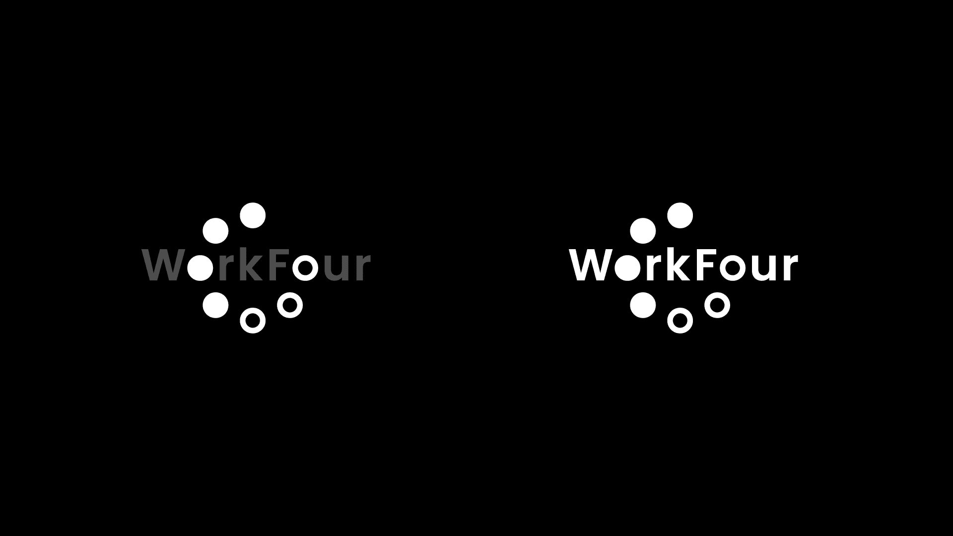
I began by exploring a wide range of typefaces and configurations. Early on, it became clear that a typeface alone wouldn't be enough, and that the logo would benefit from a distinct visual element. The name offered one: the o is shared by "Work" and "Four," which made it a natural focal point and a chance to communicate the mission visually.
The approach
Explore broadly. I tested many typefaces and layouts to see how the name worked in different forms.
Find the focal point. The shared o in the middle of the name became the place to build the idea.
Make the idea countable. The mission is a ratio: four days of work, three days off. I looked for a way to show it at a glance.
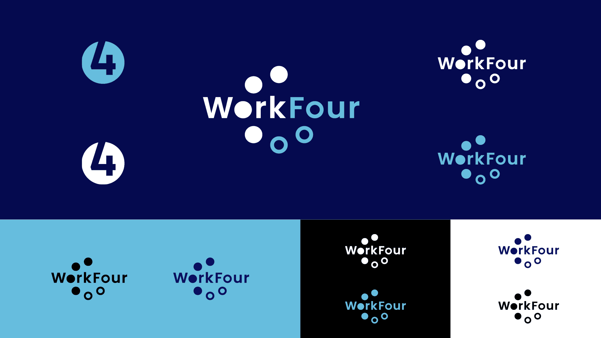
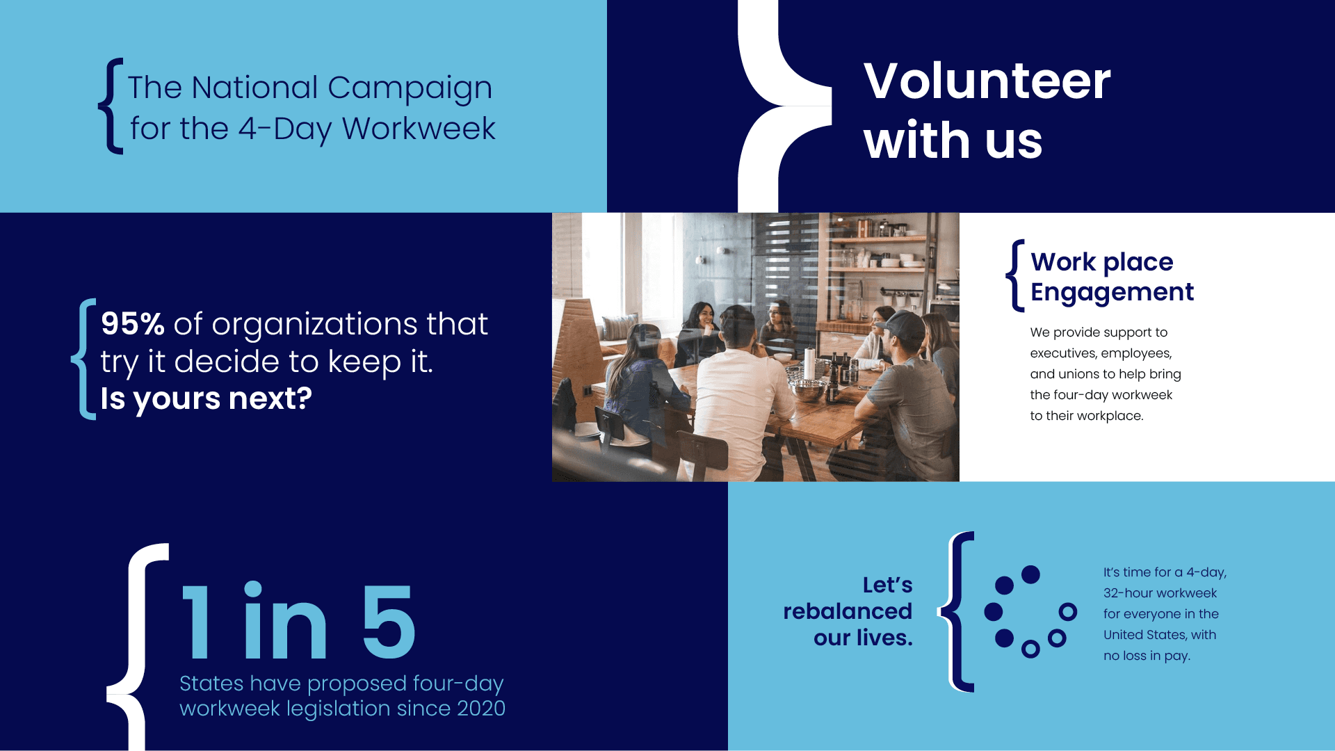
Build the palette. I developed a color palette to go with the logo and give the organization a recognizable look.
The solution
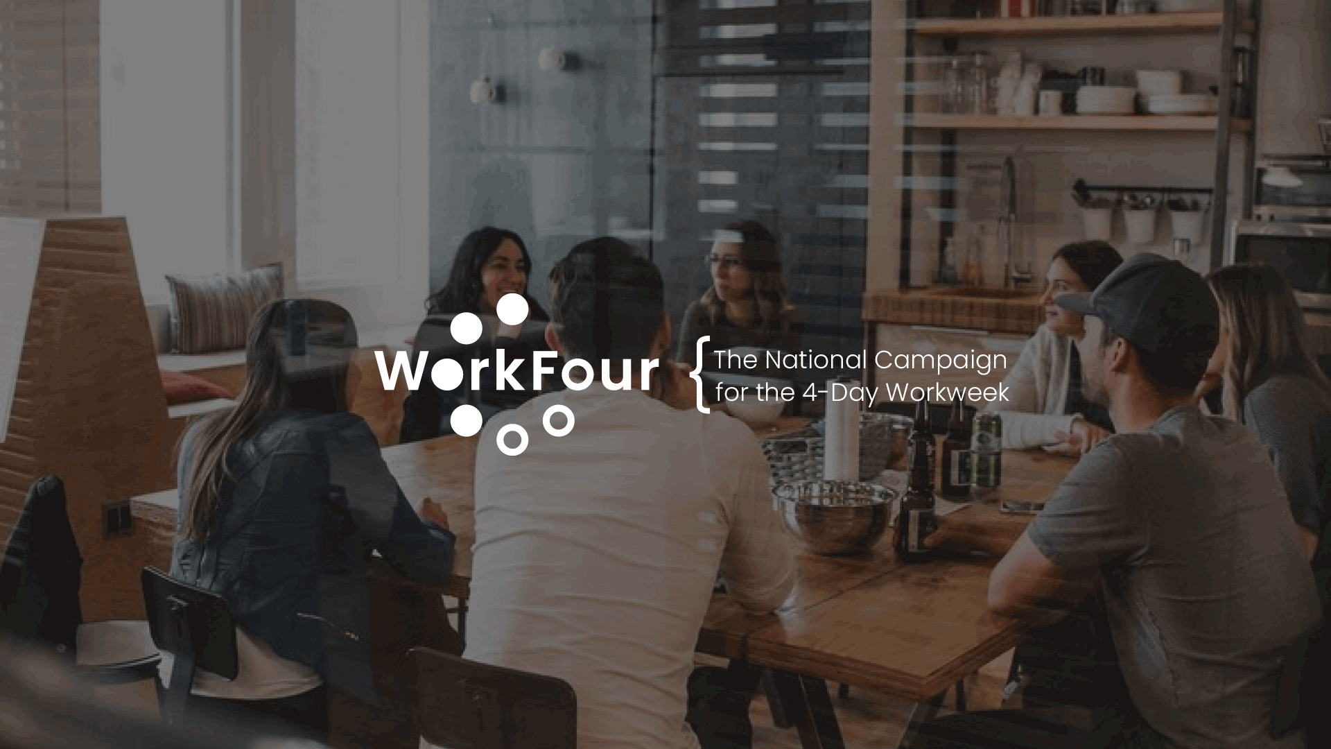
Inside the shared o is a symbol that represents the seven-day week. A circular mark made of seven segments shows four filled for workdays and three unfilled for time off. The mark is simple and memorable, and it captures the WorkFour vision in a single form. Once people know what the segments mean, the logo explains the mission every time it appears.