" height="115.96842105263157px" id="zg0FYVugh" width="76.53552631578948px"/></svg>)
This is one of my practice projects: I invent a business, set a tight deadline of about 24 hours (this one was 36 hours) of work across three days, and try to create as many brand assets as I can. It is a way to sharpen my skills and test ideas, and it is not client work.
The brief
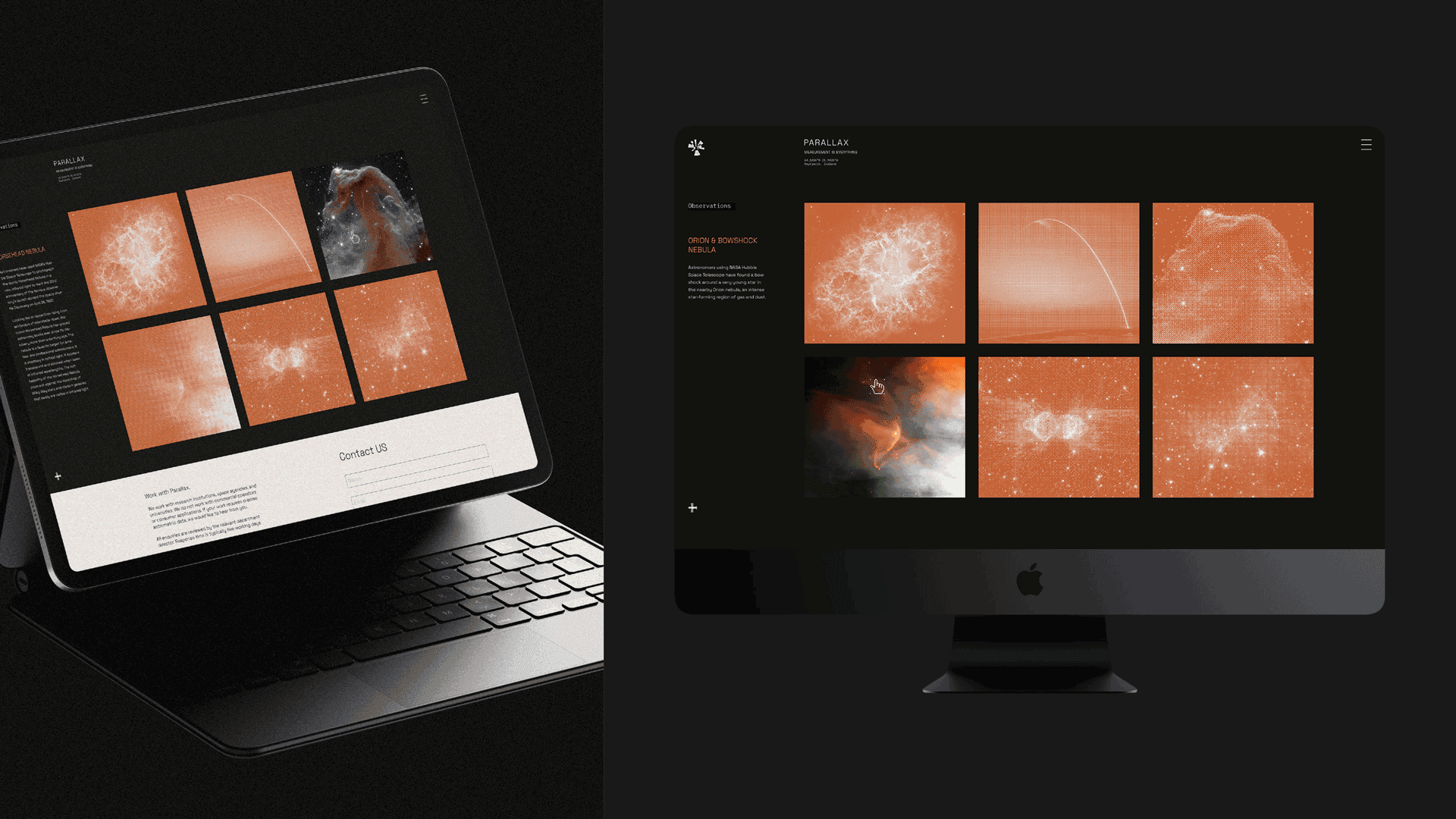
The company sits between pure academia and commercial aerospace, more rigorous than a contractor and more applied than a university. Its customers are scientists, and its work is cited in journals instead of advertised on billboards. It operates from a sparse, brutalist campus outside Reykjavik, chosen for its dark skies and geopolitical neutrality. Its culture is quiet, methodical, and deeply serious.
The challenge
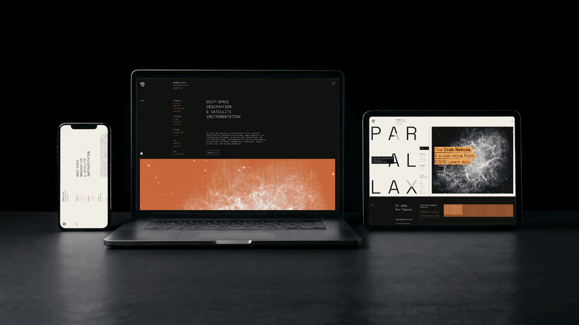
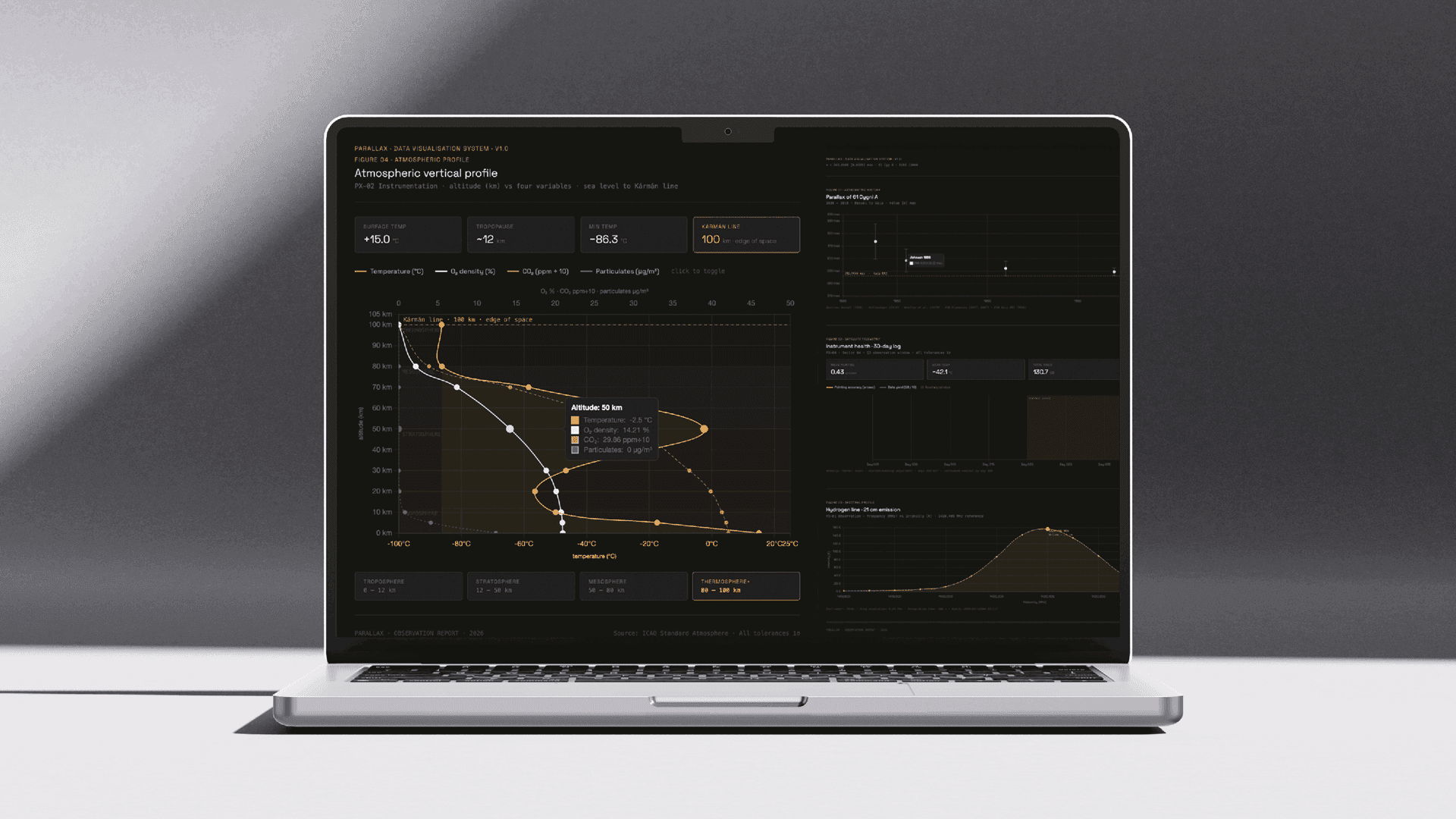
How do you give a brand to an organization whose audience distrusts branding? Scientists value accuracy over polish, and a flashy aerospace look would signal the opposite of what Parallax stands for. The identity needed to feel precise, restrained, and credible, while still being memorable.
What I found
The most distinctive thing about Parallax was already in its name. Parallax is the apparent shift of a star's position when viewed from two different points, and it is how astronomers measure distance. The name is a measurement, so the brand could be built on one.
The solution
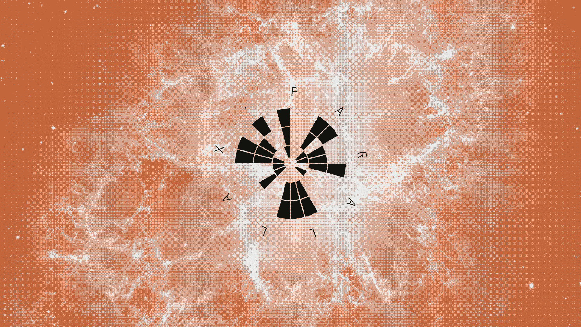
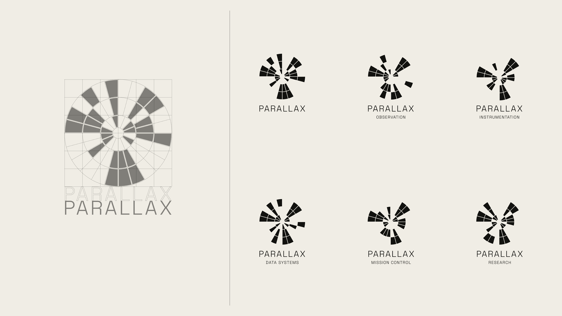
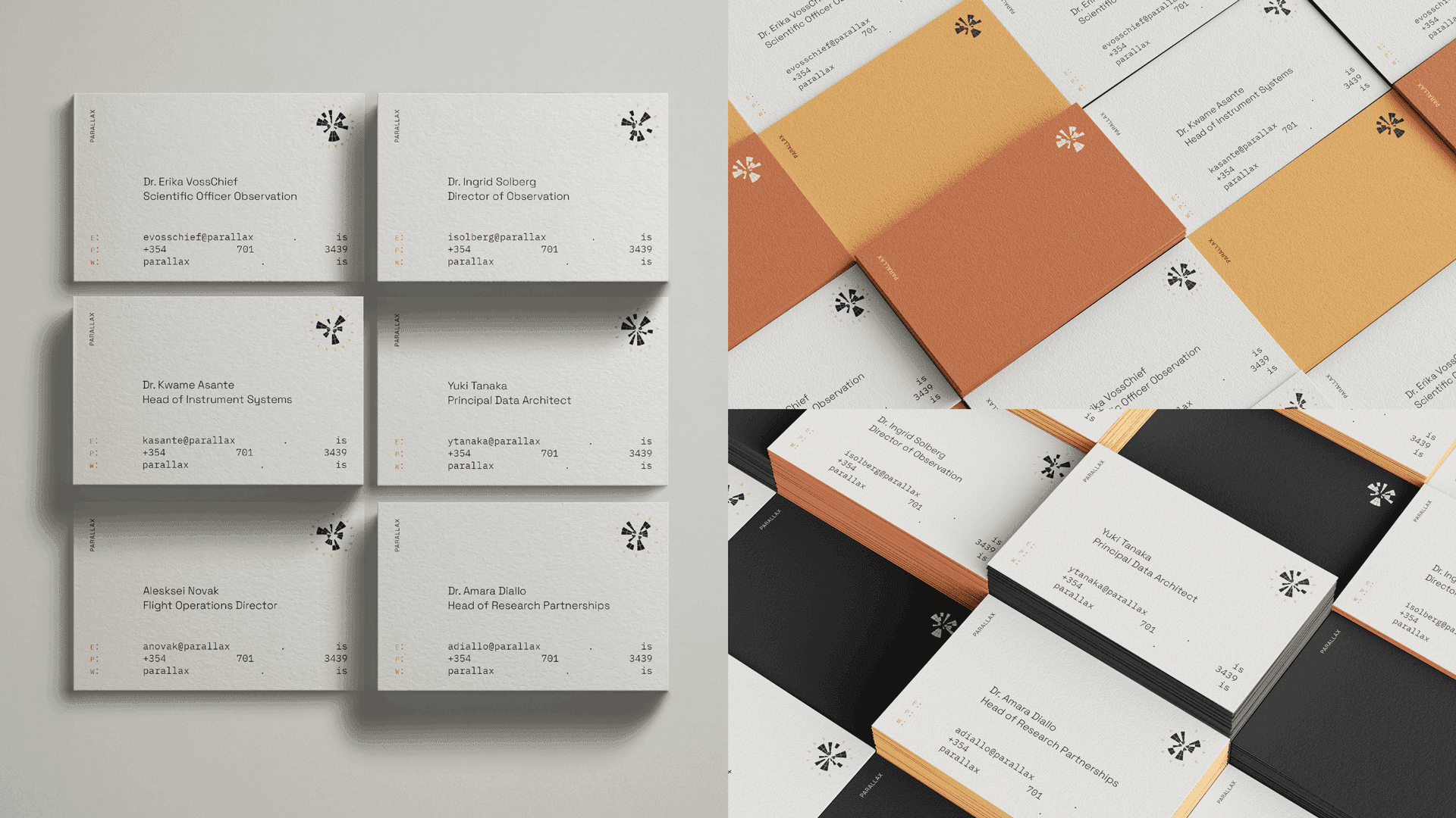
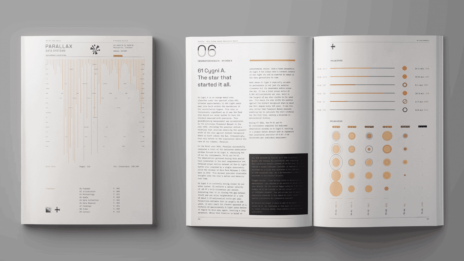
The Parallax logomark is a satellite dish drawn as a concentric-ring panel array. The value 285.9949 is written as ASCII binary, with eight bits per character, and each filled panel is a 1 and each empty panel a 0. The mark can be read as a symbol at a glance and decoded as data by anyone who wants to check it. The number that gives the company its name is built into the logo itself.