" height="115.96842105263157px" id="zg0FYVugh" width="76.53552631578948px"/></svg>)
The inspiration
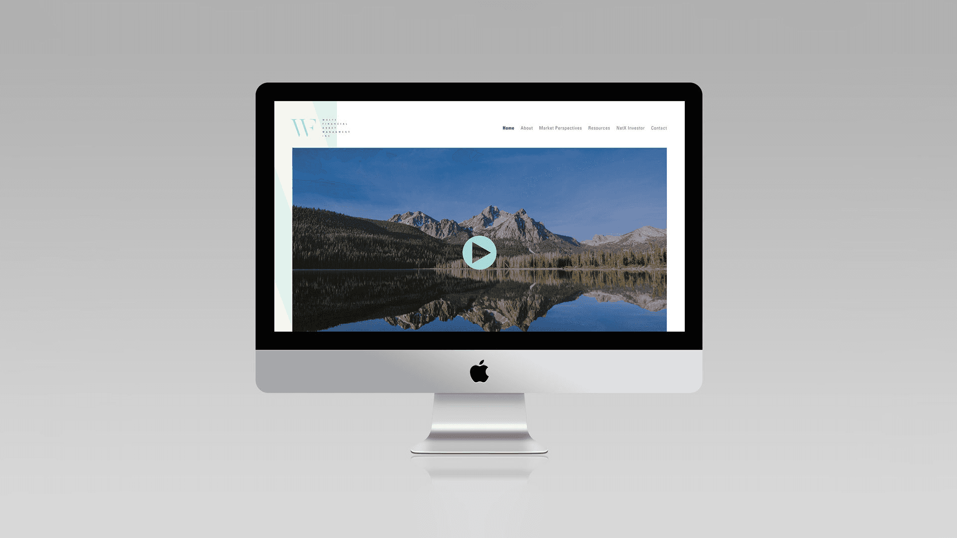
Wolfe Financial is a small asset management firm based in Idaho. During my research, what stood out was the number of educational videos on its website, made to help clients learn about their finances and feel empowered to make decisions.
The challenge
Financial brands tend to look alike: navy blue, a generic icon, a stock-photo handshake. A small firm that puts education first needed an identity that signals trust and clarity, and that feels like a partner and not an institution.
What I found
The firm's commitment to teaching its clients suggested a different kind of relationship: guiding, not selling. That became the idea behind the whole identity: guiding your future into alignment.
The approach
Find the idea in their behavior. The educational content pointed to a firm that helps clients understand, not just manage.
Turn the idea into a visual device. Alignment is a visual concept, so the identity could show it, not just state it.
Work with the letters. The initials W and F gave me a built-in structure to explore.
Test and simplify. I tried different ways of removing and combining parts of each letter until the result felt clear and memorable.
The solution
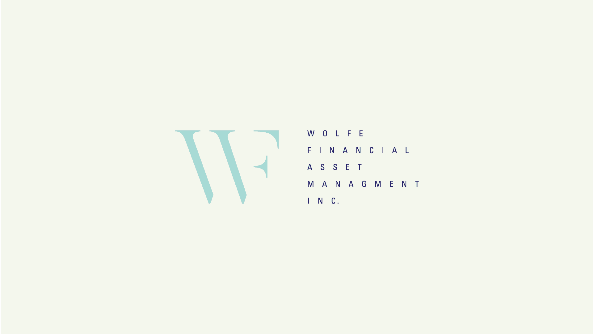
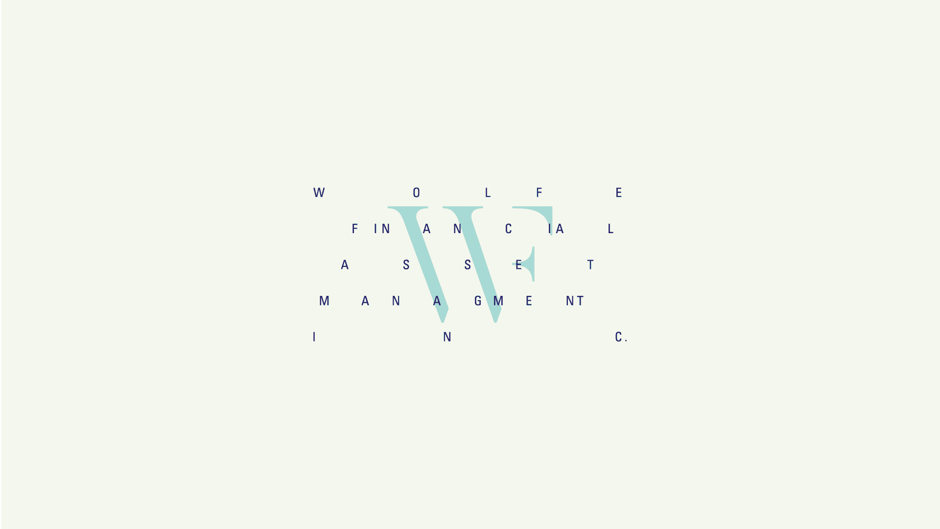
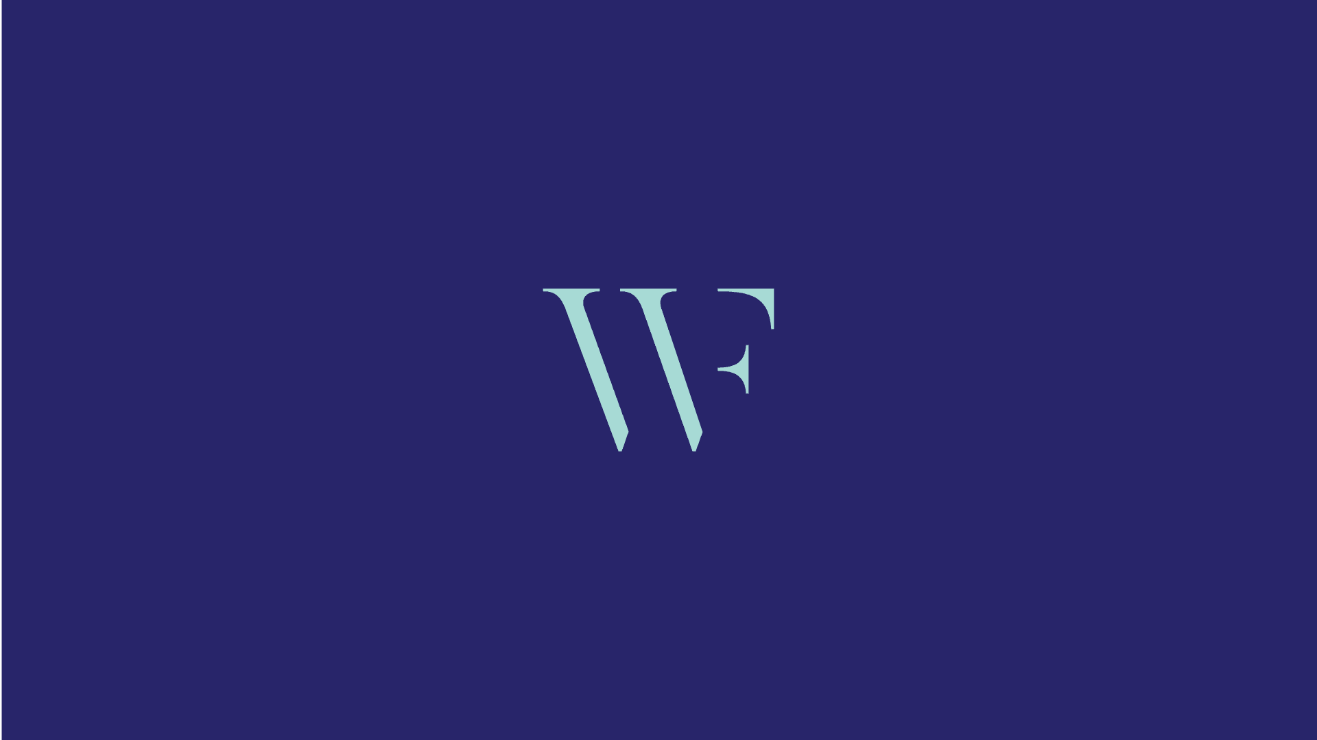
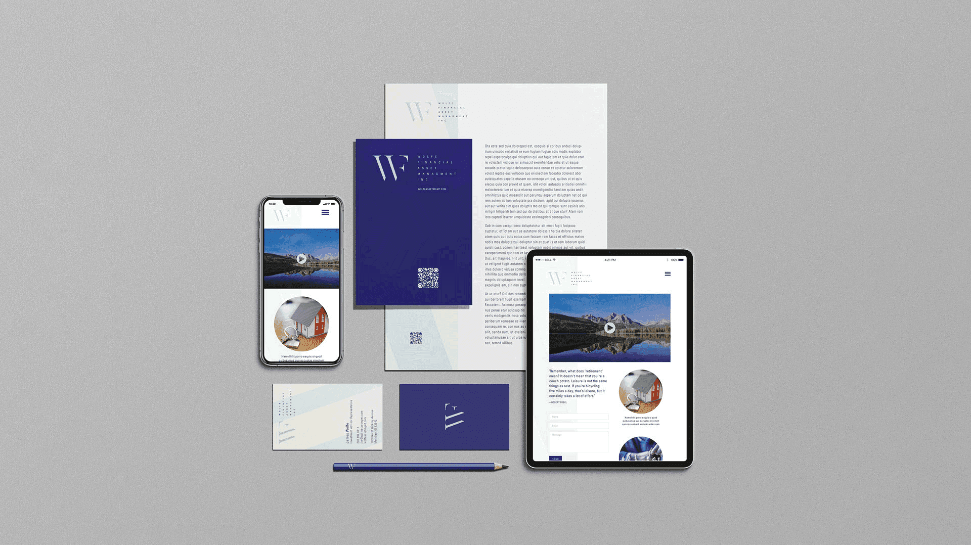
The logo is a ligature of the W from "Wolfe" and the F from "Financial," with parts of each letter removed. On their own, the leftover pieces look like abstract shapes. When they come together, they rebuild both letters, showing the idea of guiding into alignment. The mark rewards a second look, which fits a brand built around learning.