" height="115.96842105263157px" id="zg0FYVugh" width="76.53552631578948px"/></svg>)
The challenge
The brewery needed an identity that could express two ideas at once: a place rooted in its neighborhood, and a brand that connects the past, present, and future. It also had to stand out on a crowded shelf without relying on the usual brewery imagery.
What I found
Exploring the city of Pittsburgh, I was struck by the strength of its communities and the unbreakable bonds they form. That became the idea at the center of the brand: community as a structural force, not just a friendly sentiment.
The solution
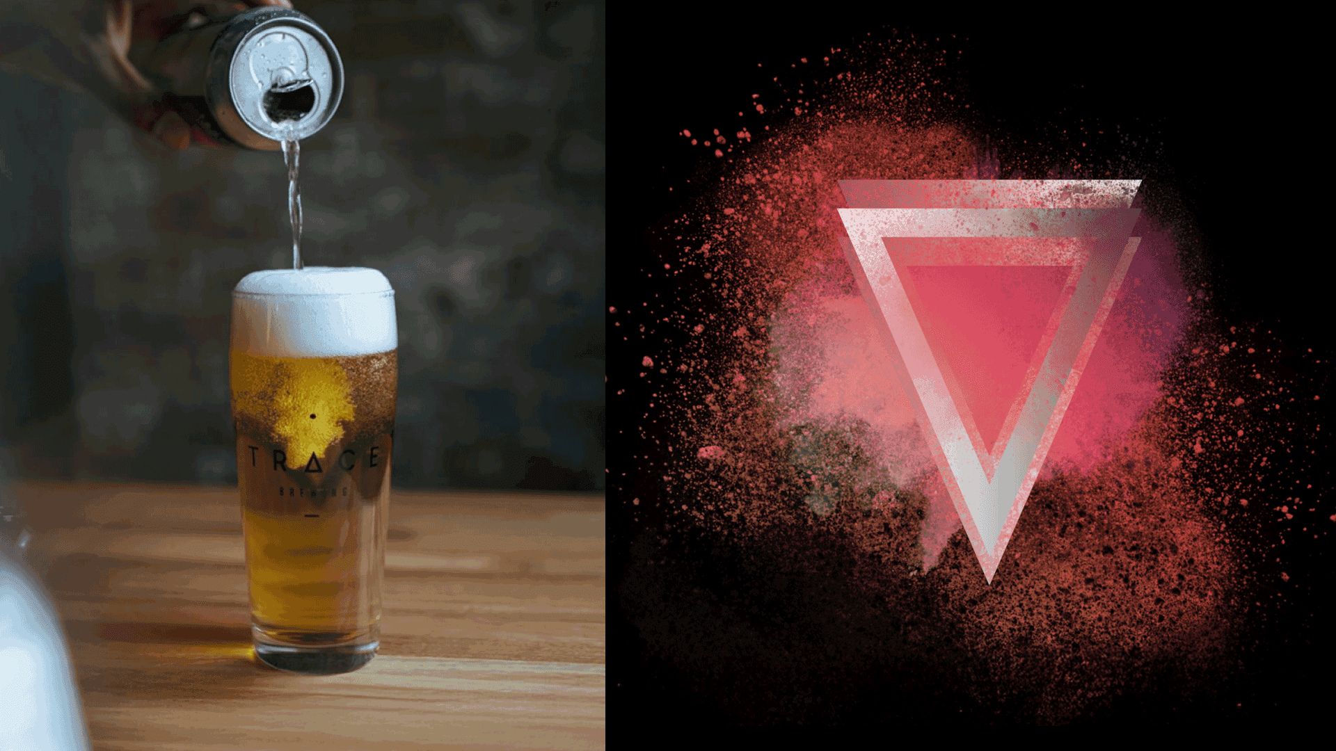
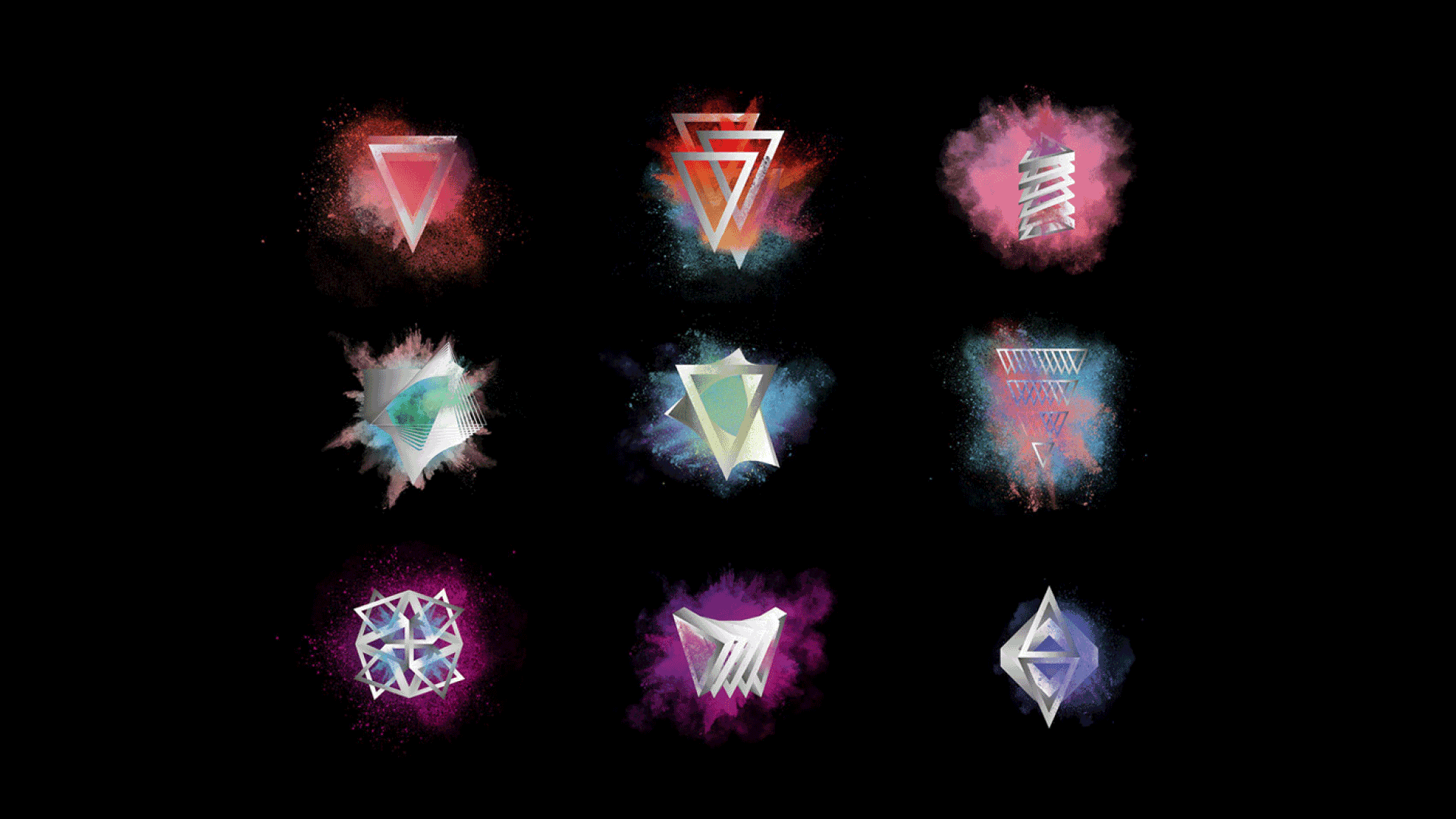
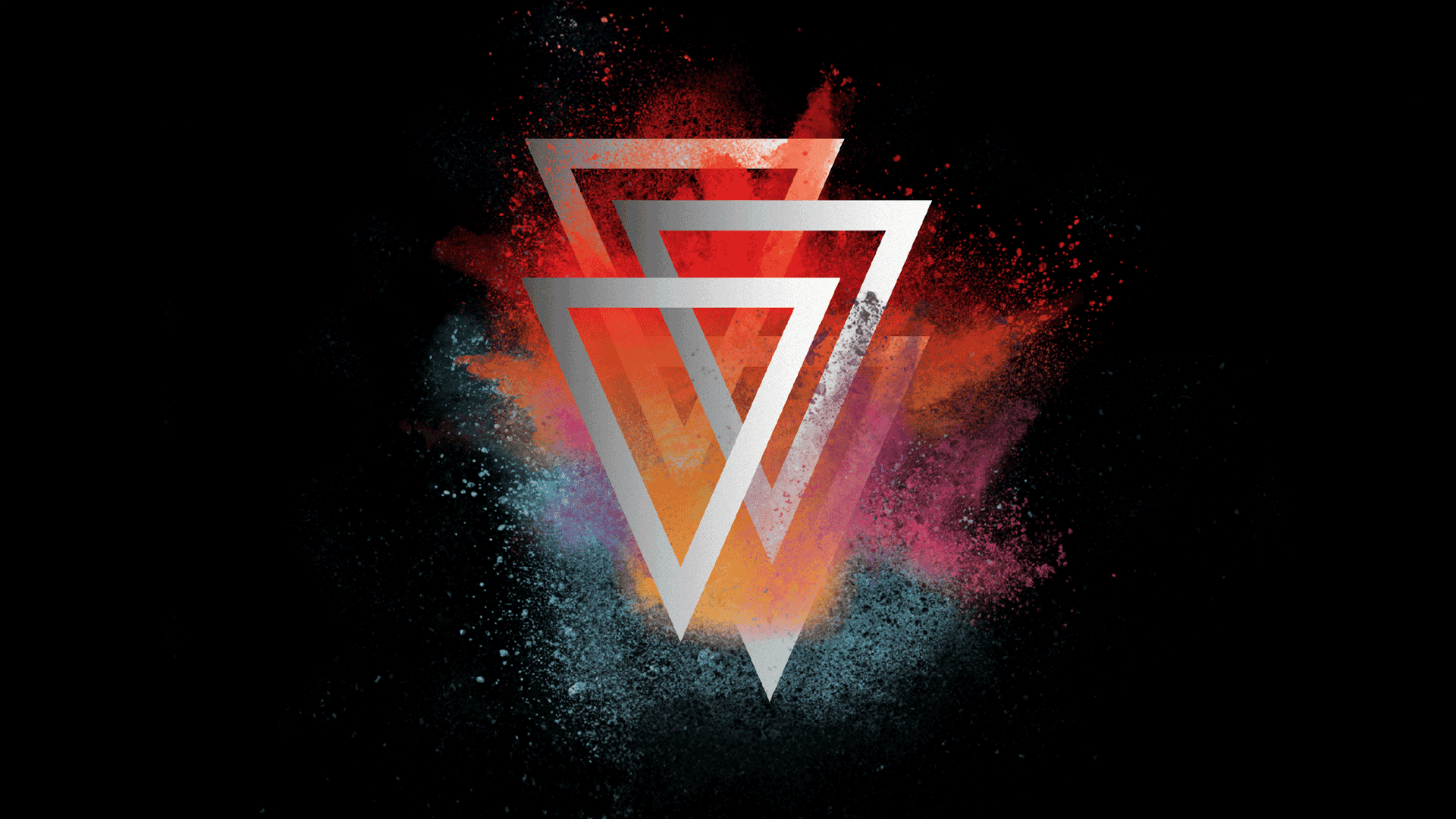
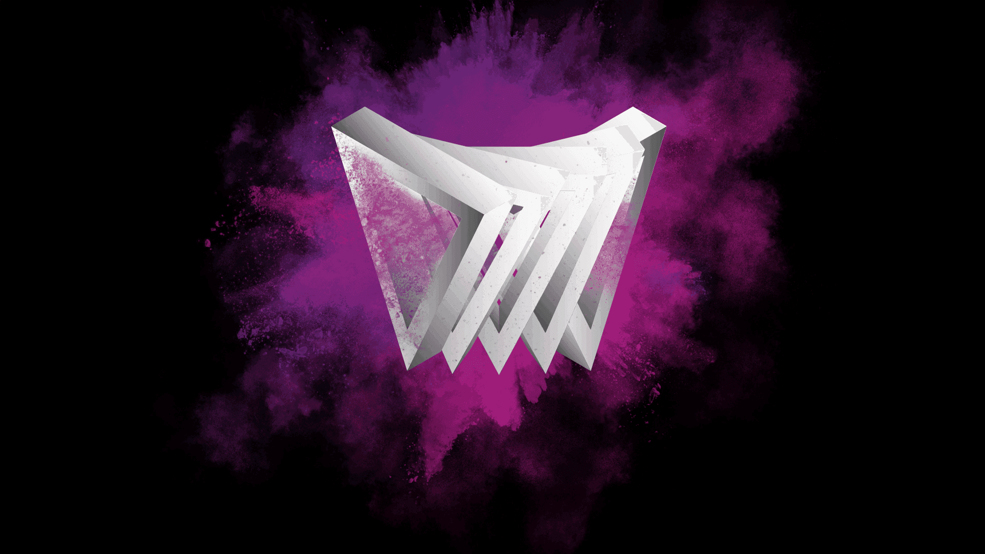
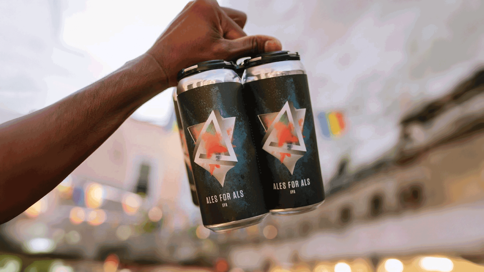
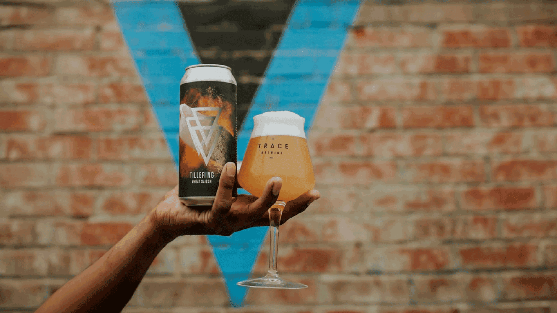
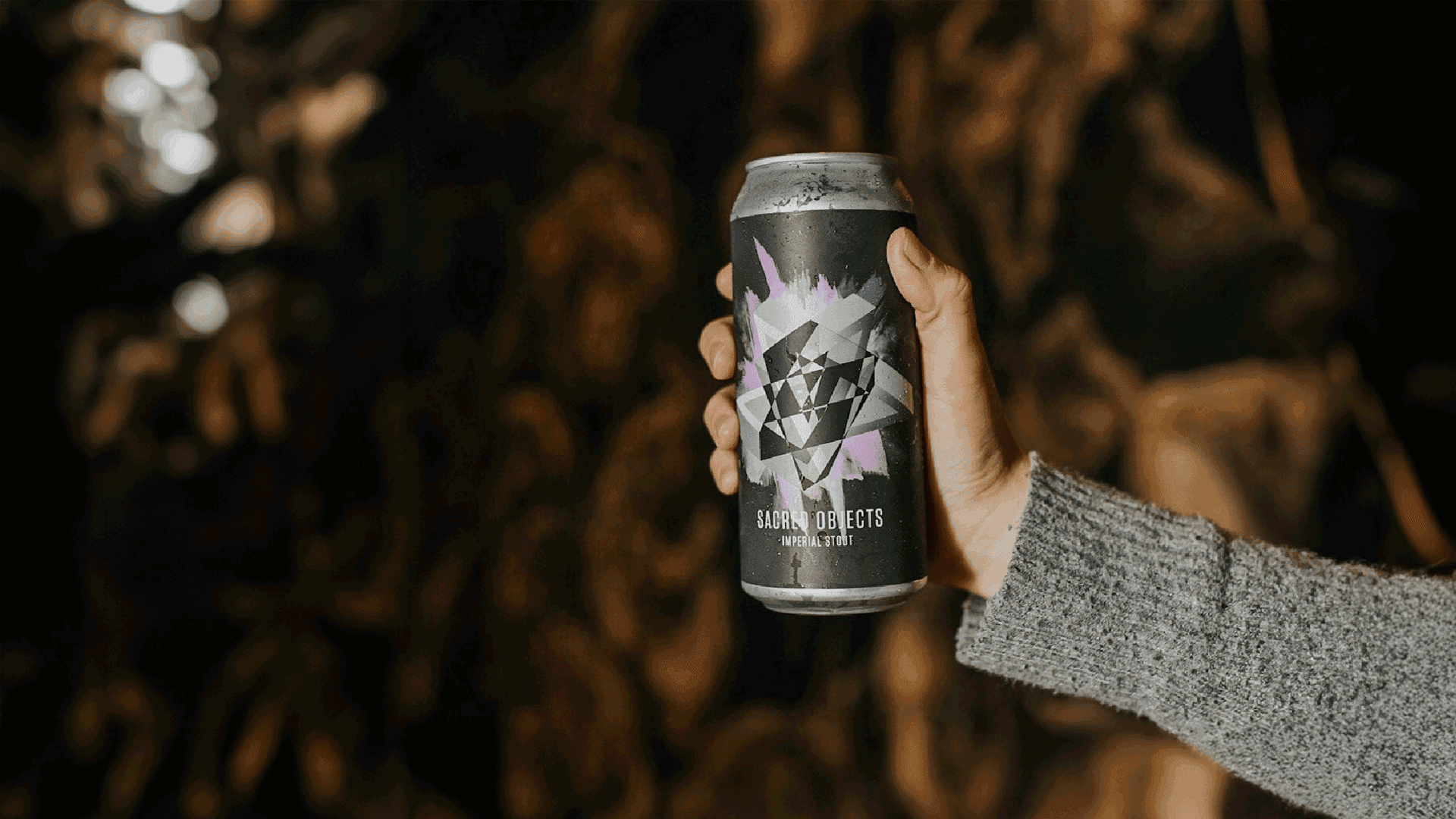
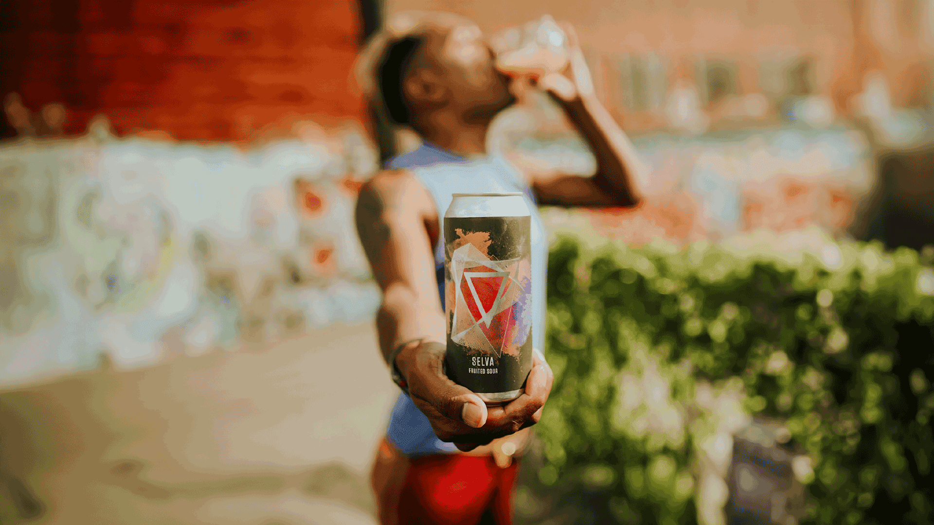
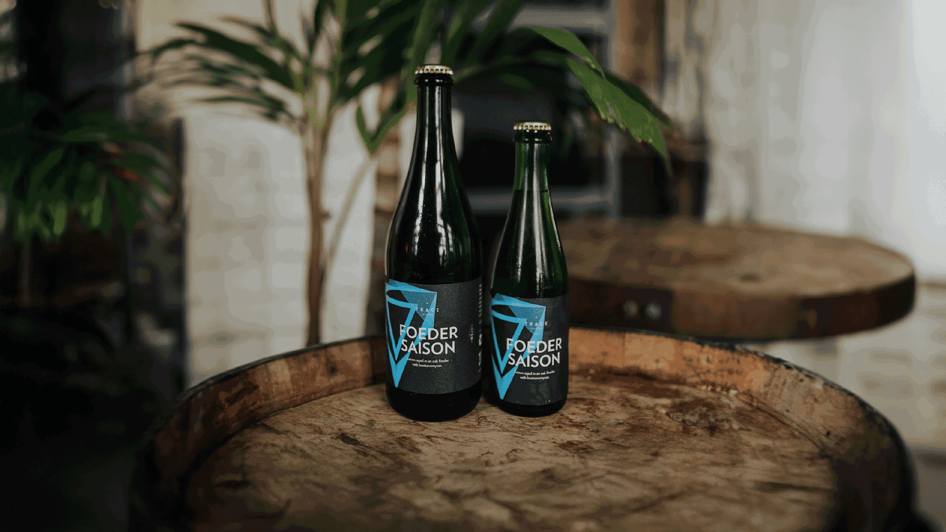
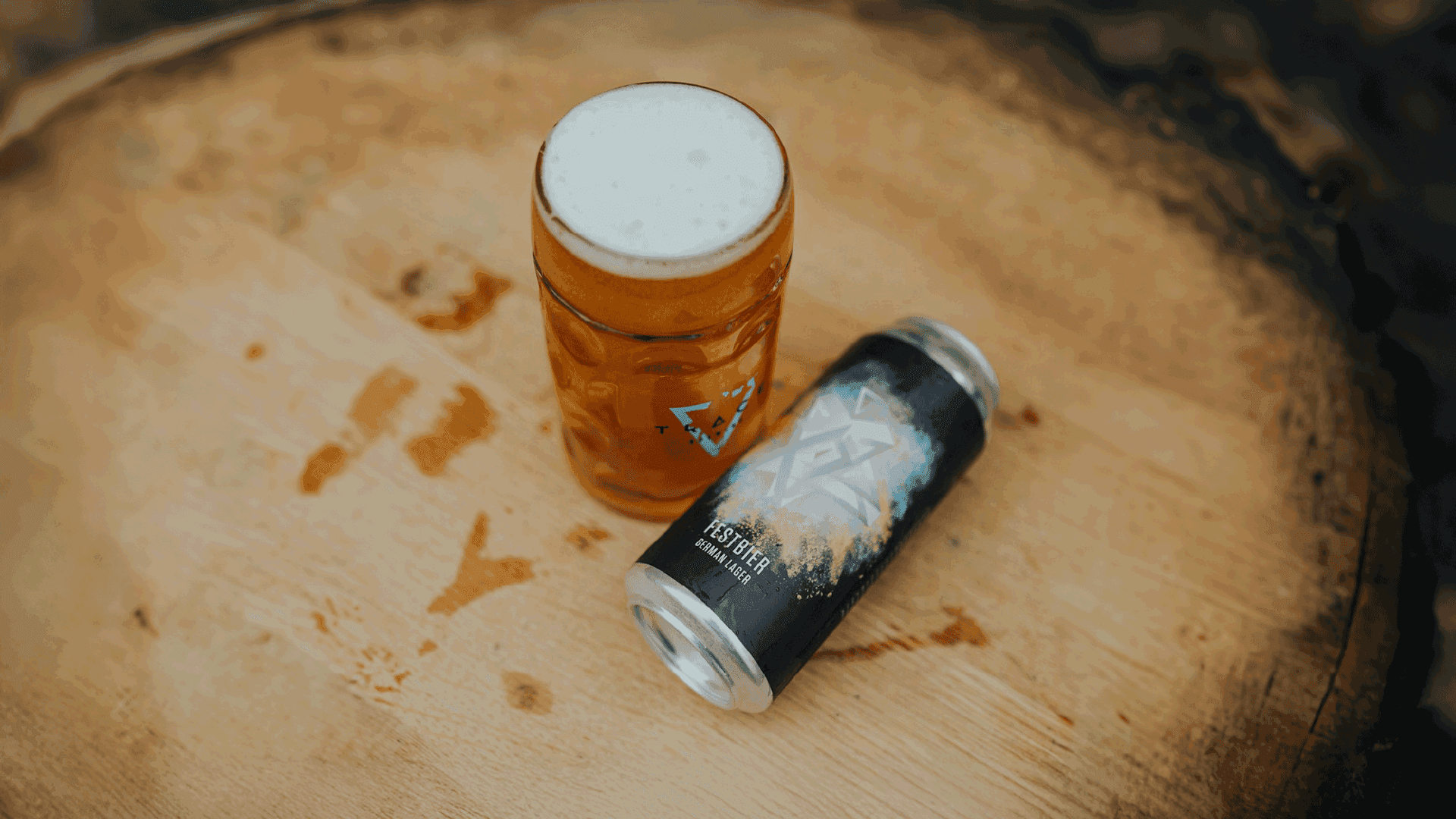
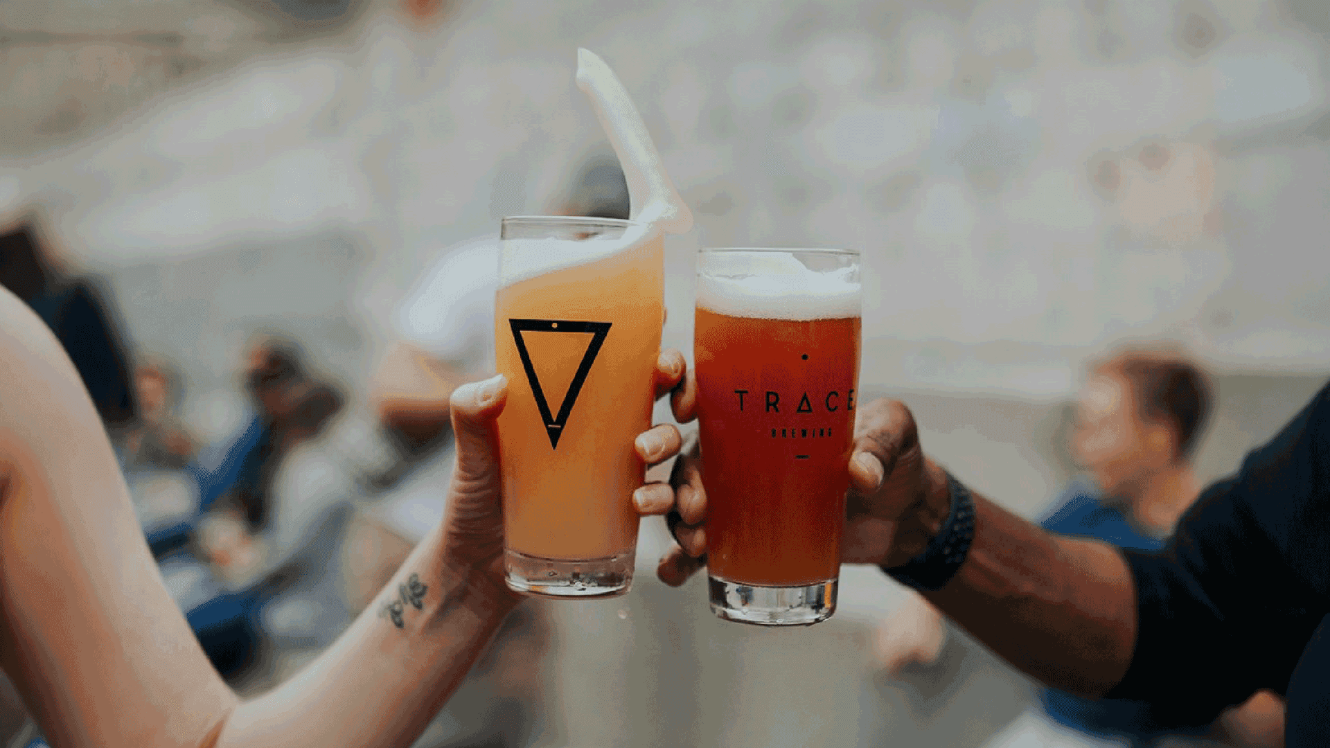
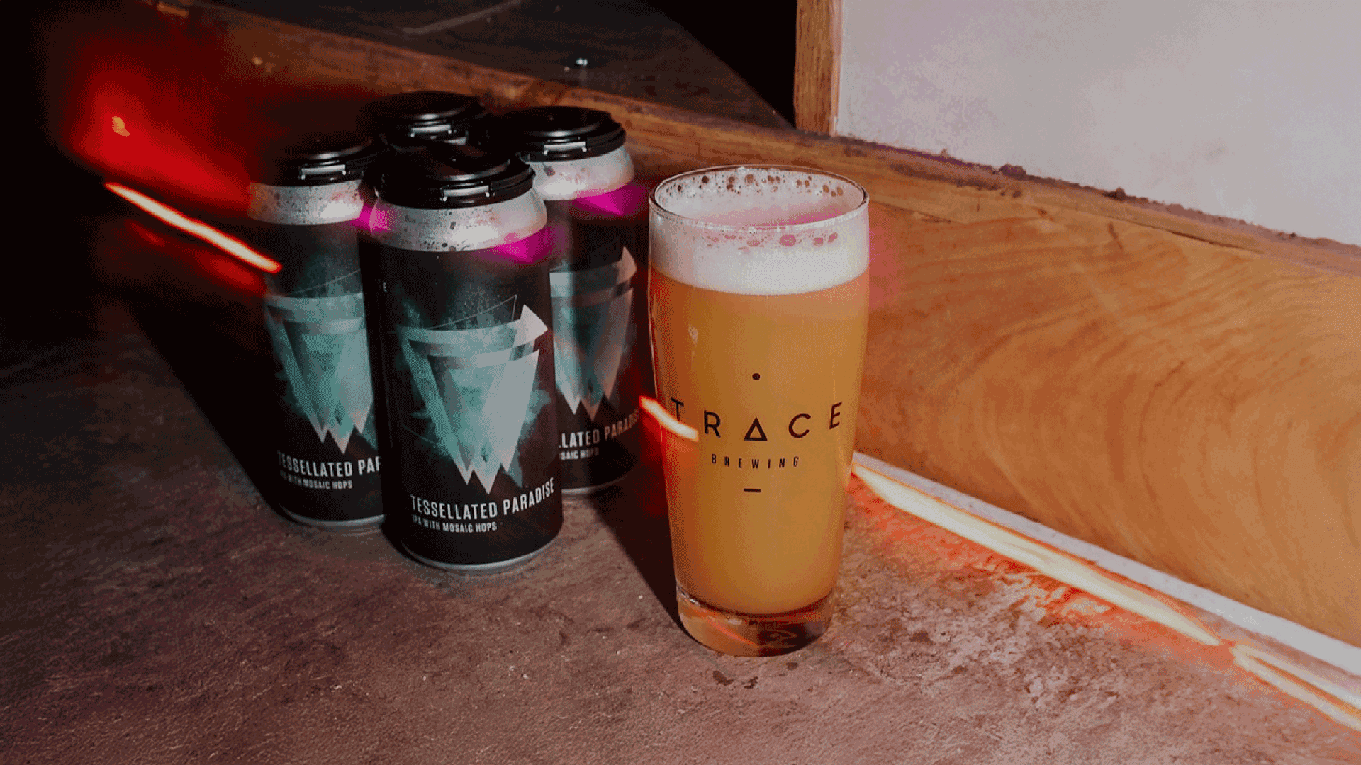
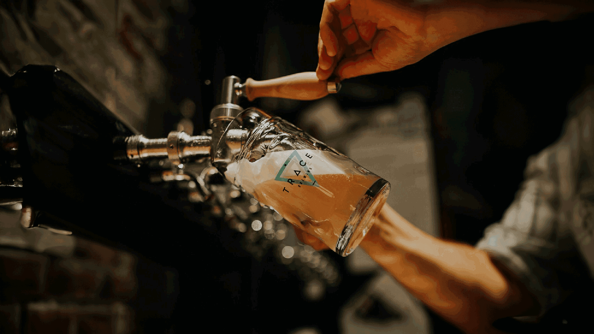
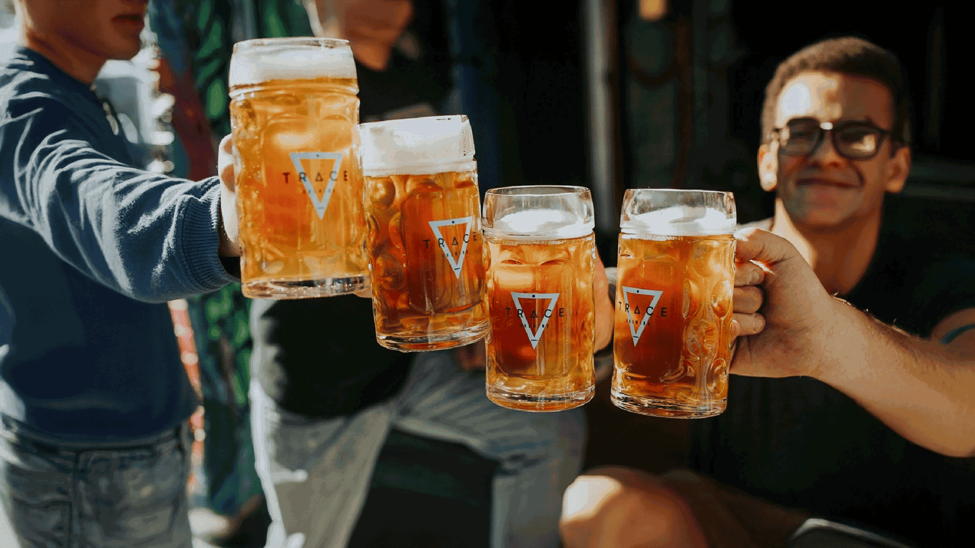
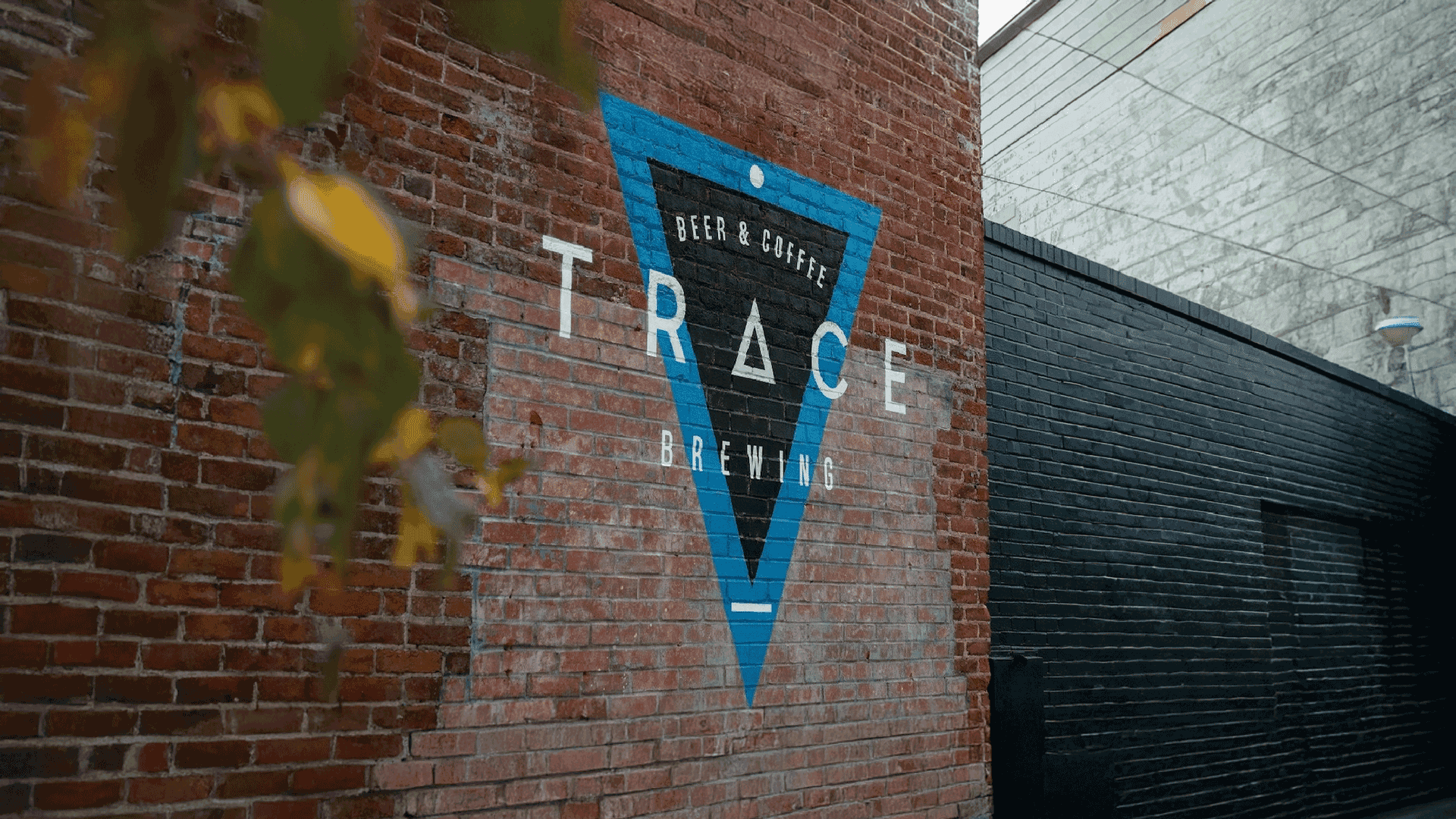
The logo is built on a triangle, chosen for its strength and stability, to represent bonds that last and a bridge between the past, present, and future. On the can art, a burst of bubbles forms just behind the logo, like beer cascading into a glass. The result is a design that links the brand's idea with the experience of drinking the beer.