" height="115.96842105263157px" id="zg0FYVugh" width="76.53552631578948px"/></svg>)
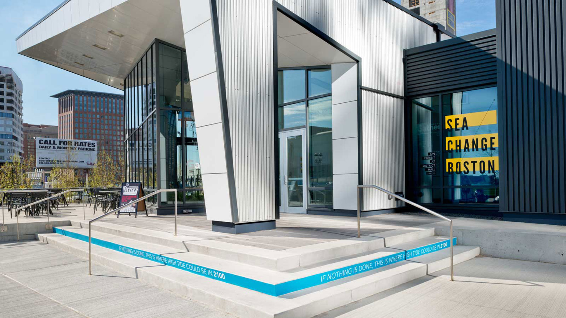
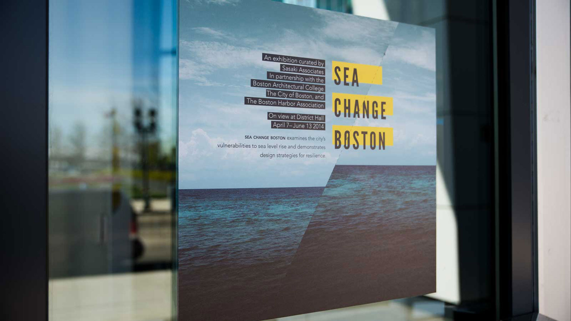
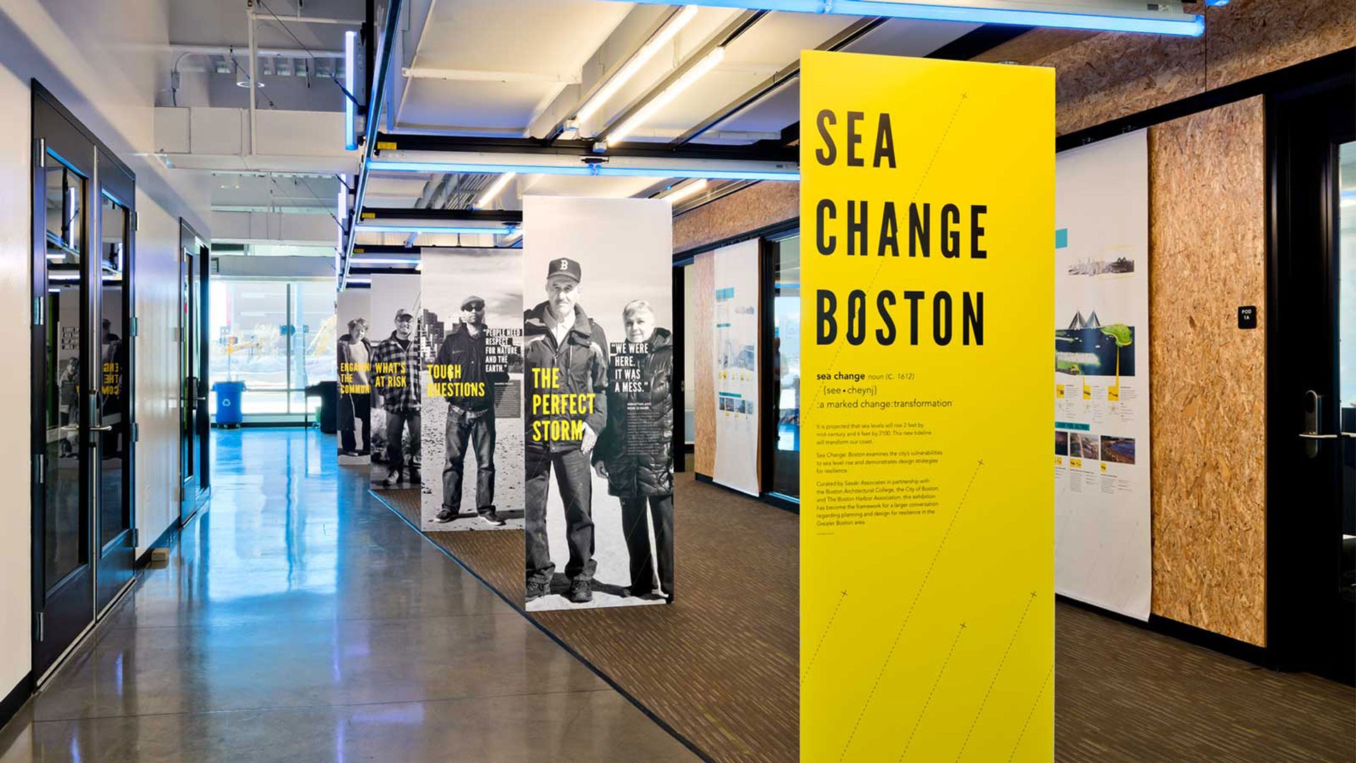
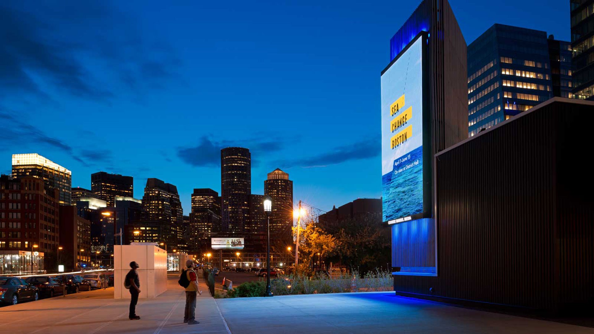
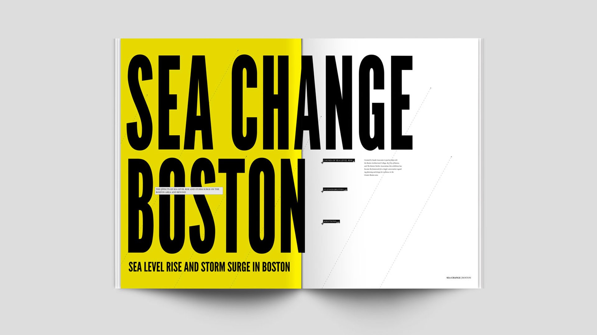
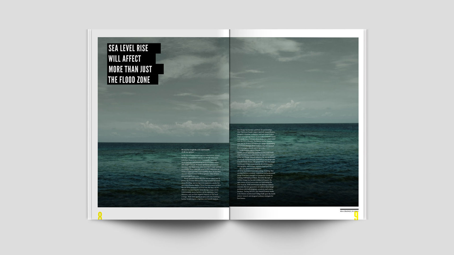
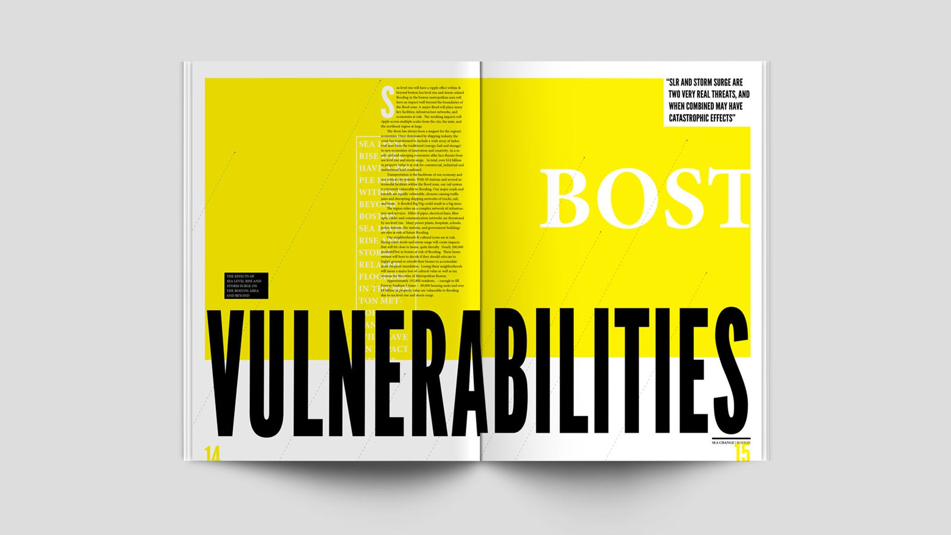
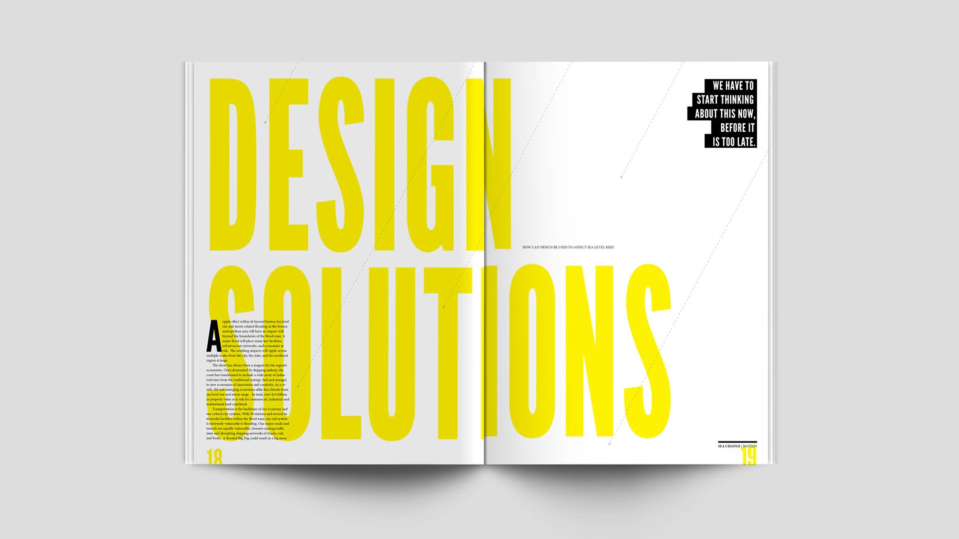
At the heart of the exhibit lay a pivotal concept reflected in its visual elements—namely, the literal offsetting in imagery and typography. The color yellow, integral to the exhibit's design, drew inspiration from the warning signals used in the U.S. maritime warning flag system. Dotted lines placed throughout the exhibit mirrored storm tracking lines. Furthermore, the exhibition harnessed its physical space by configuring the lighting to change in real-time, synchronized with tide data. We also created an interactive map with an address search so you could see how sea level rise over time could effect your address within the city limits.
Central to the exhibit's importance was its ability to foster a deep connection with the concept of rising sea levels. To achieve this, we created 7-foot-tall pillars, each bearing the true stories of individuals from the greater Boston area, making the impact of sea level rise tangible and personal.
Images courtesy Sasaki Associates.