" height="115.96842105263157px" id="zg0FYVugh" width="76.53552631578948px"/></svg>)
The challenge
Brewery branding leans on the same cliches, and hops in the logo is the most common one. Remnant needed to avoid that and still come across as a modern, enjoyable place for a good experience.
What I found
Before any design, the brand needed a point of view about who it was for and what the place was meant to feel like. The strongest idea came from the name: a remnant is something left over, and a place where people gather has a rhythm that repeats.
The solution
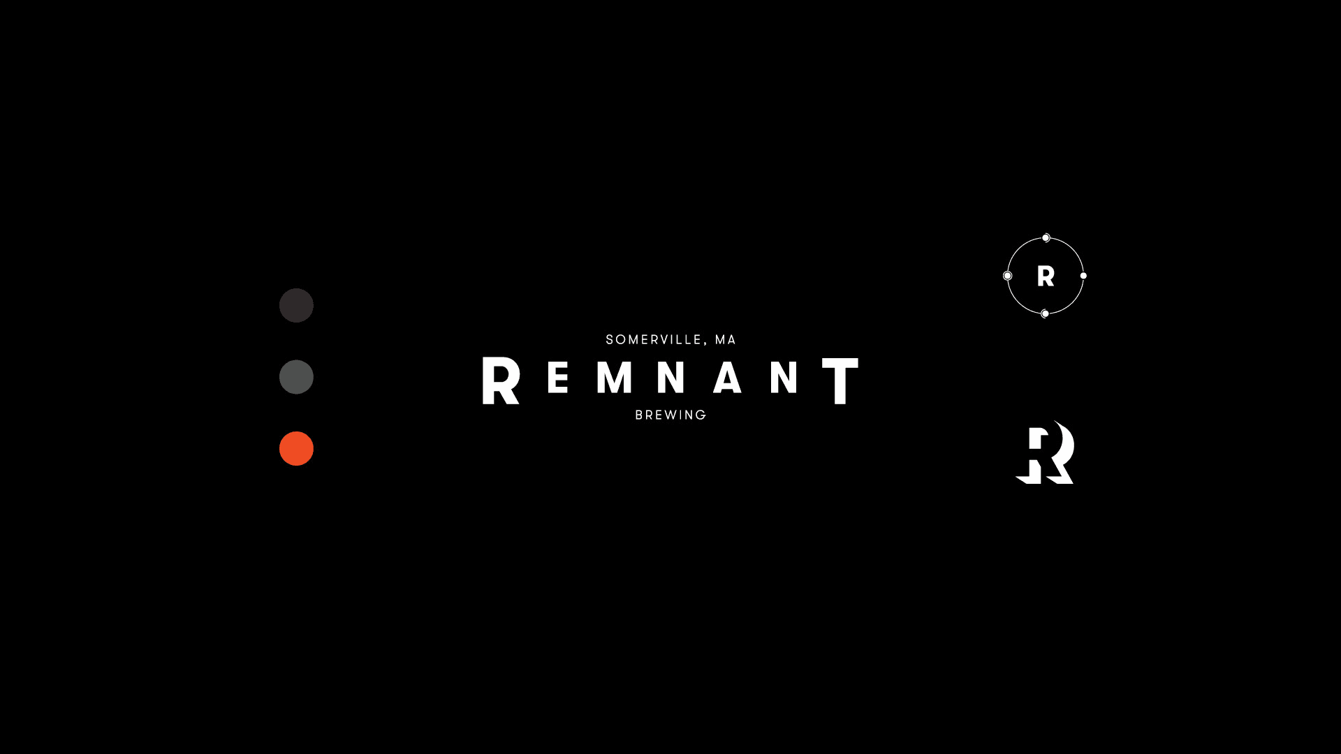
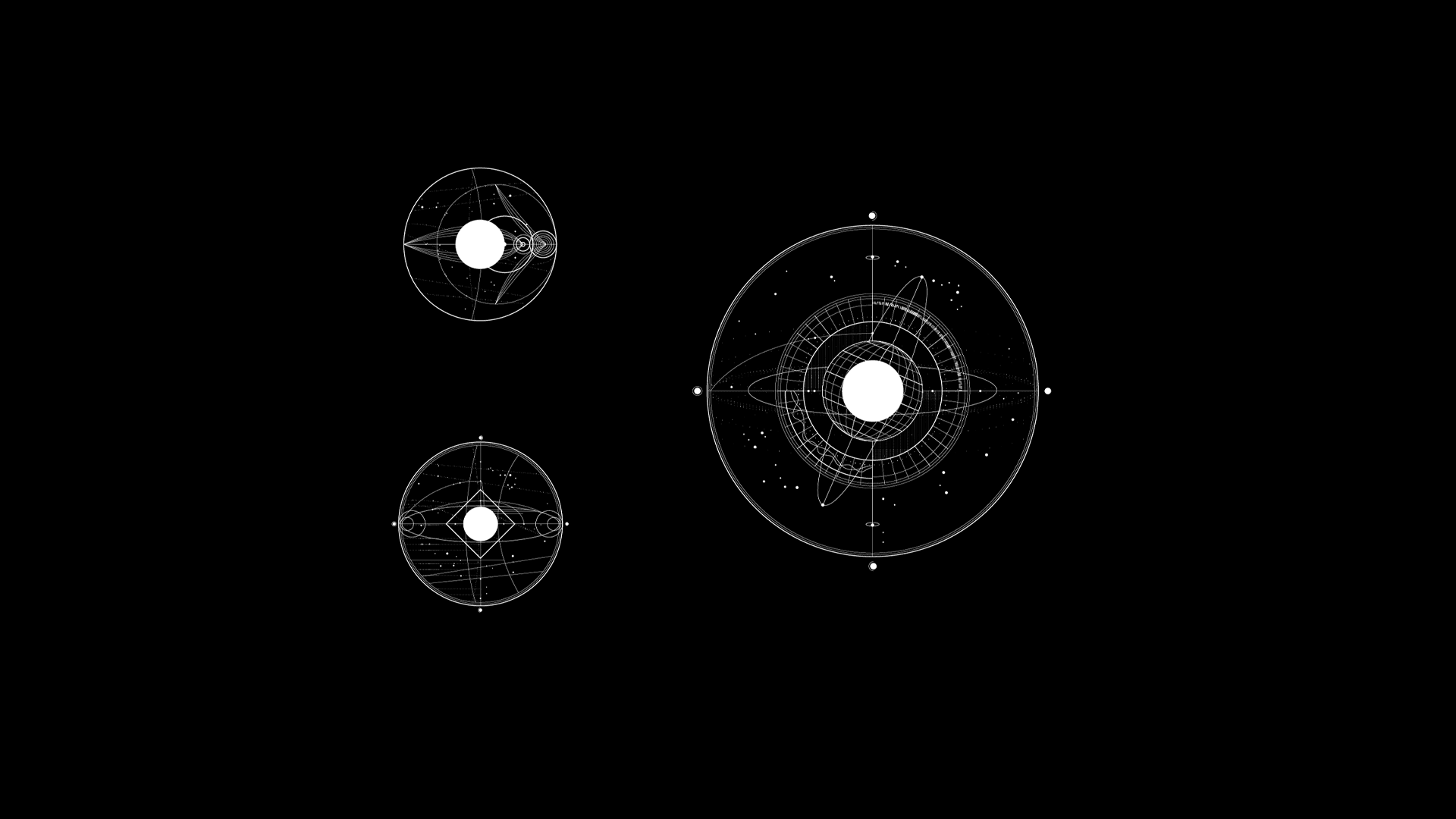
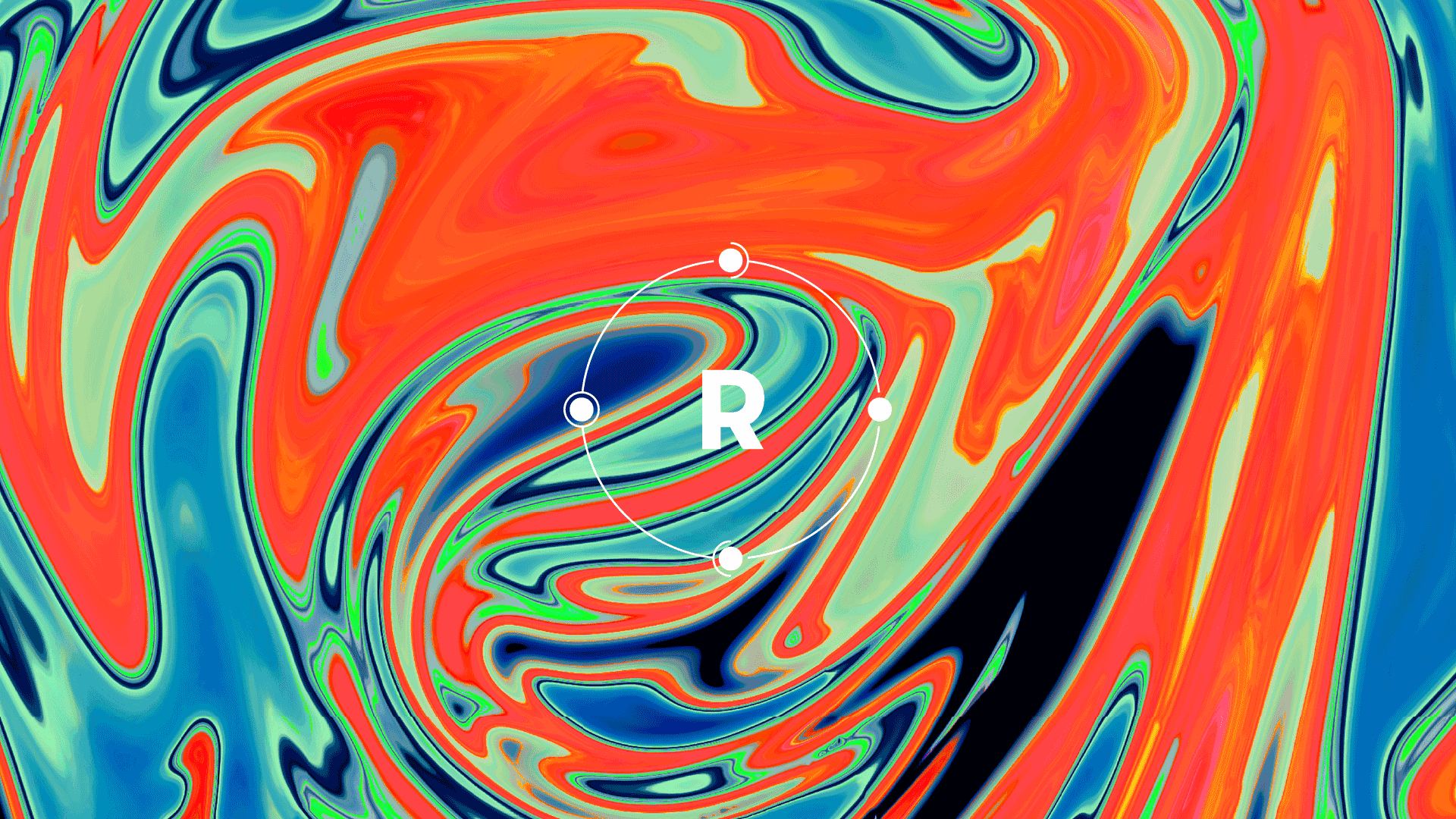
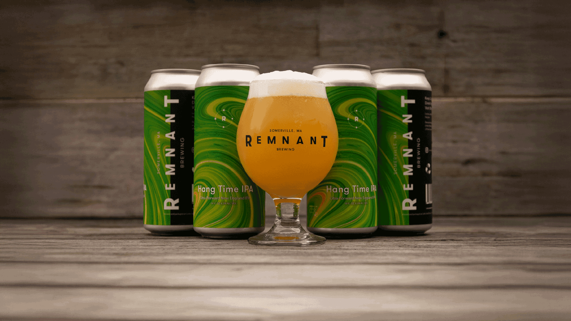
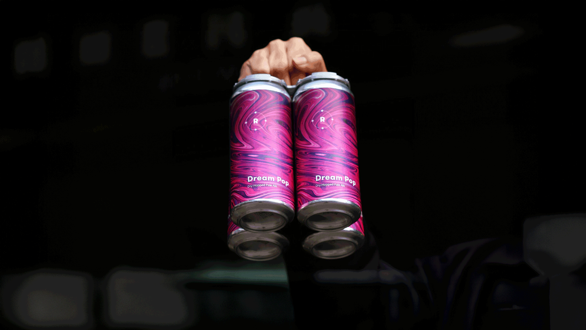
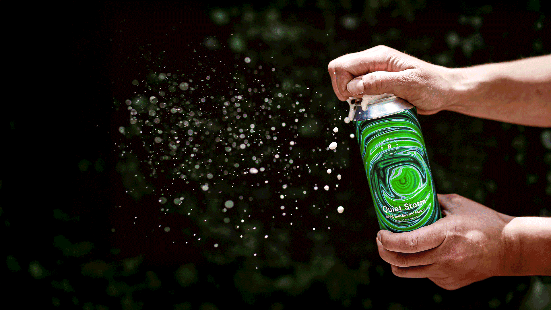
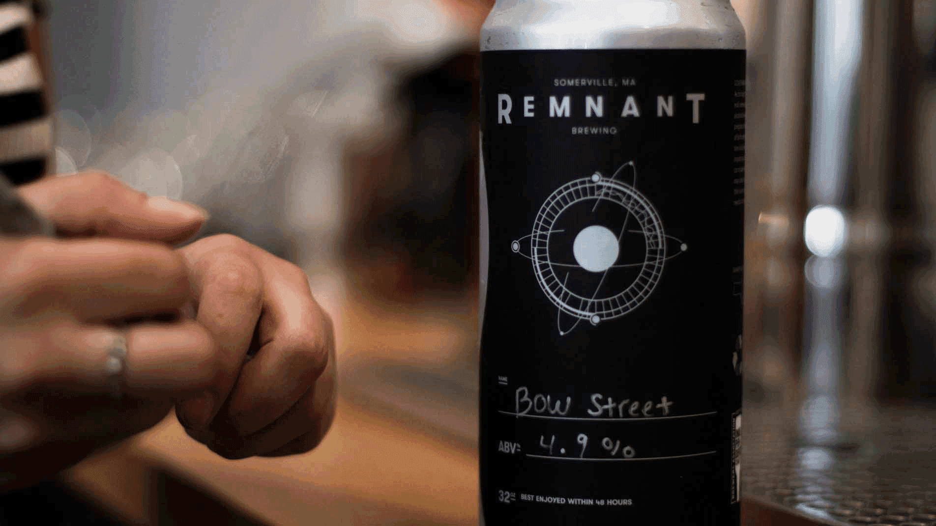
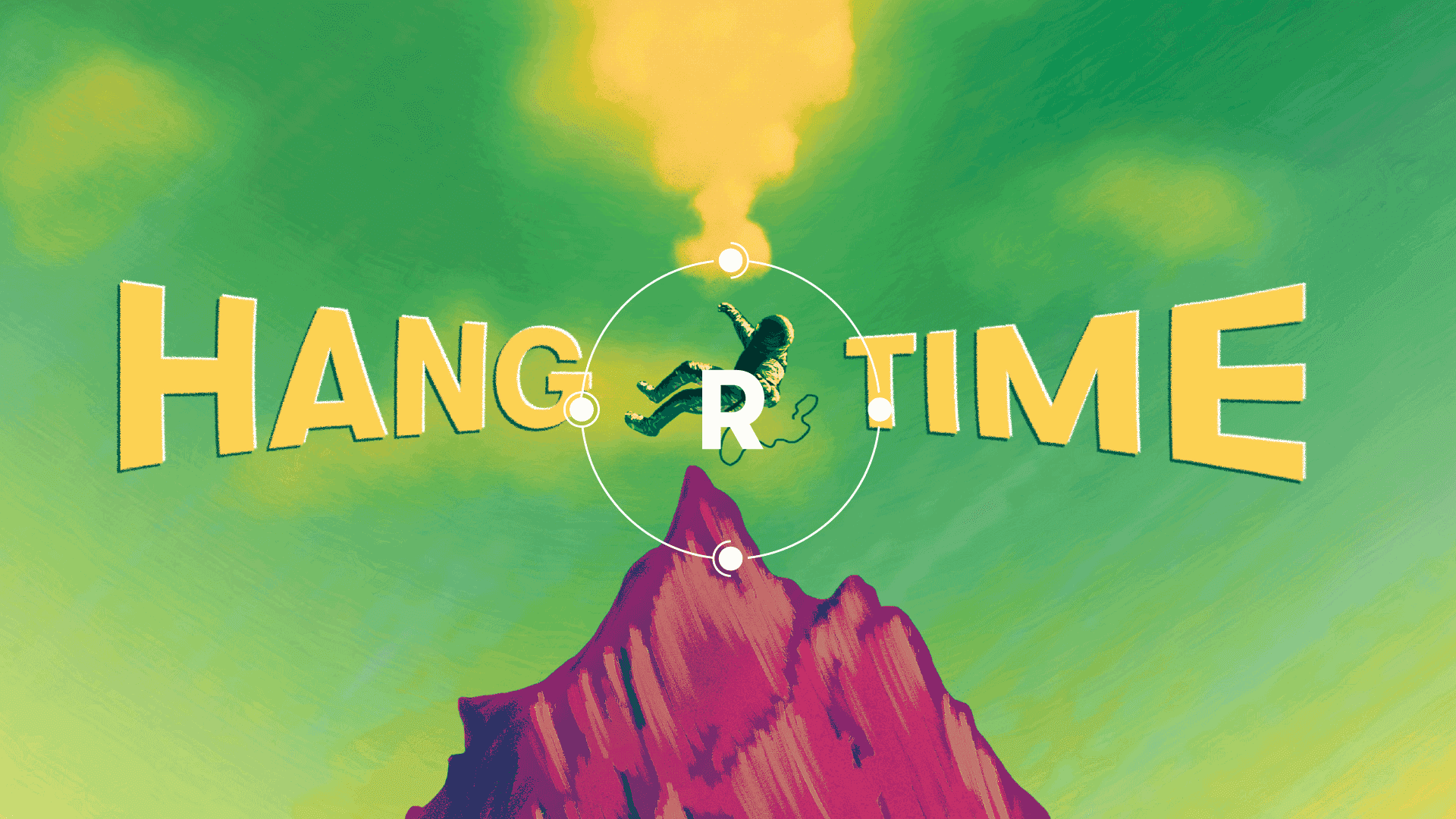
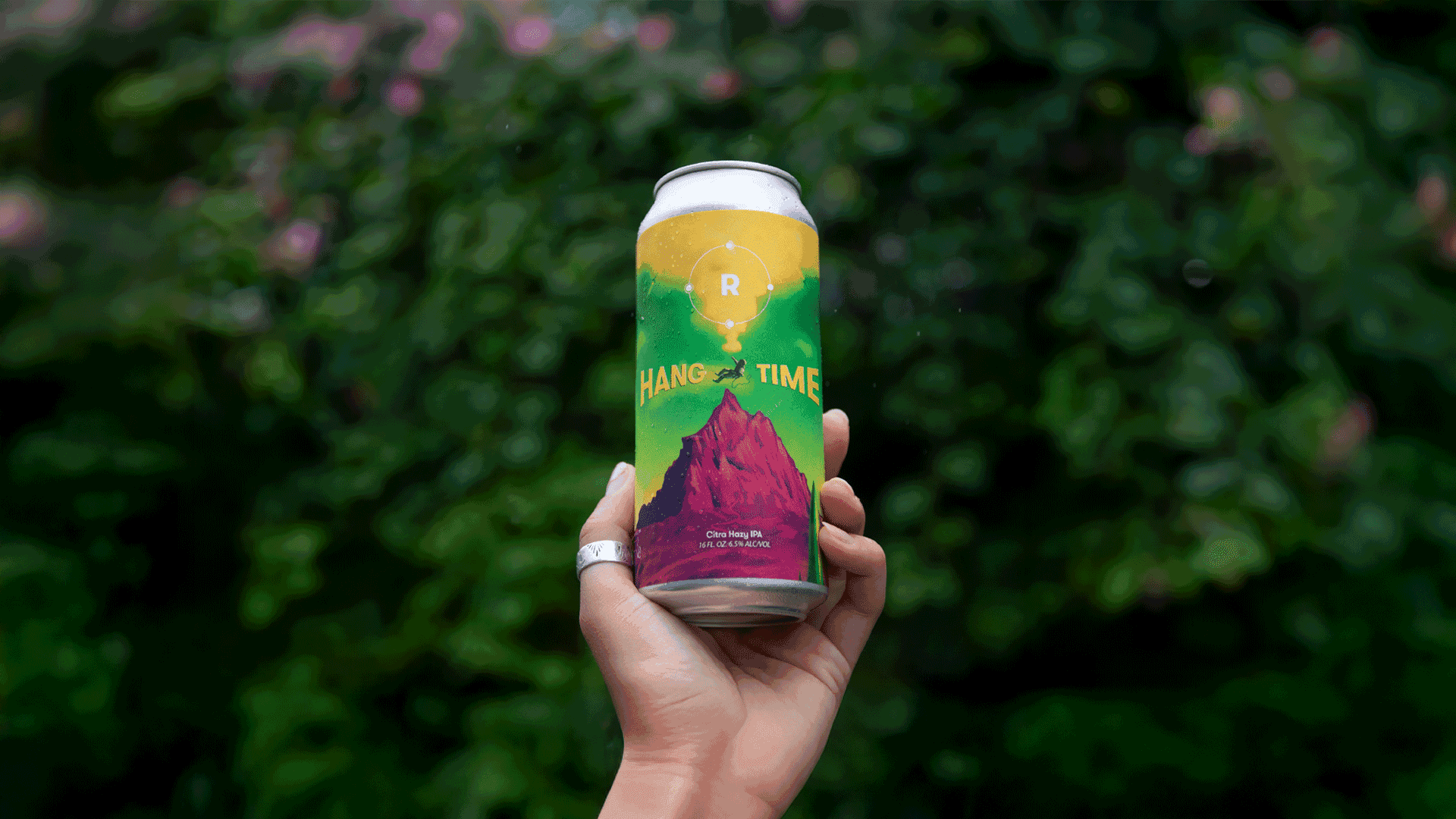
The identity riffs on the moon as a remnant of the earth and the steady cycle it follows. It gives the brewery a distinctive look without relying on the usual beer imagery, and it carries a story that customers can pick up on without being told.