" height="115.96842105263157px" id="zg0FYVugh" width="76.53552631578948px"/></svg>)
The challenge
Cambridge has thirteen distinct neighborhoods, and the initiative needed to represent all of them while still reading as one community. It also had to communicate something harder than a logo usually does: that progress is happening, even when it happens slowly, and that residents' voices are shaping it.
What I found
Cambridge has become a cultural melting pot over the years, and a single-color, single-symbol identity would have flattened that. The brand had to feel professional enough for a city government and approachable enough for the people it serves.
The solution
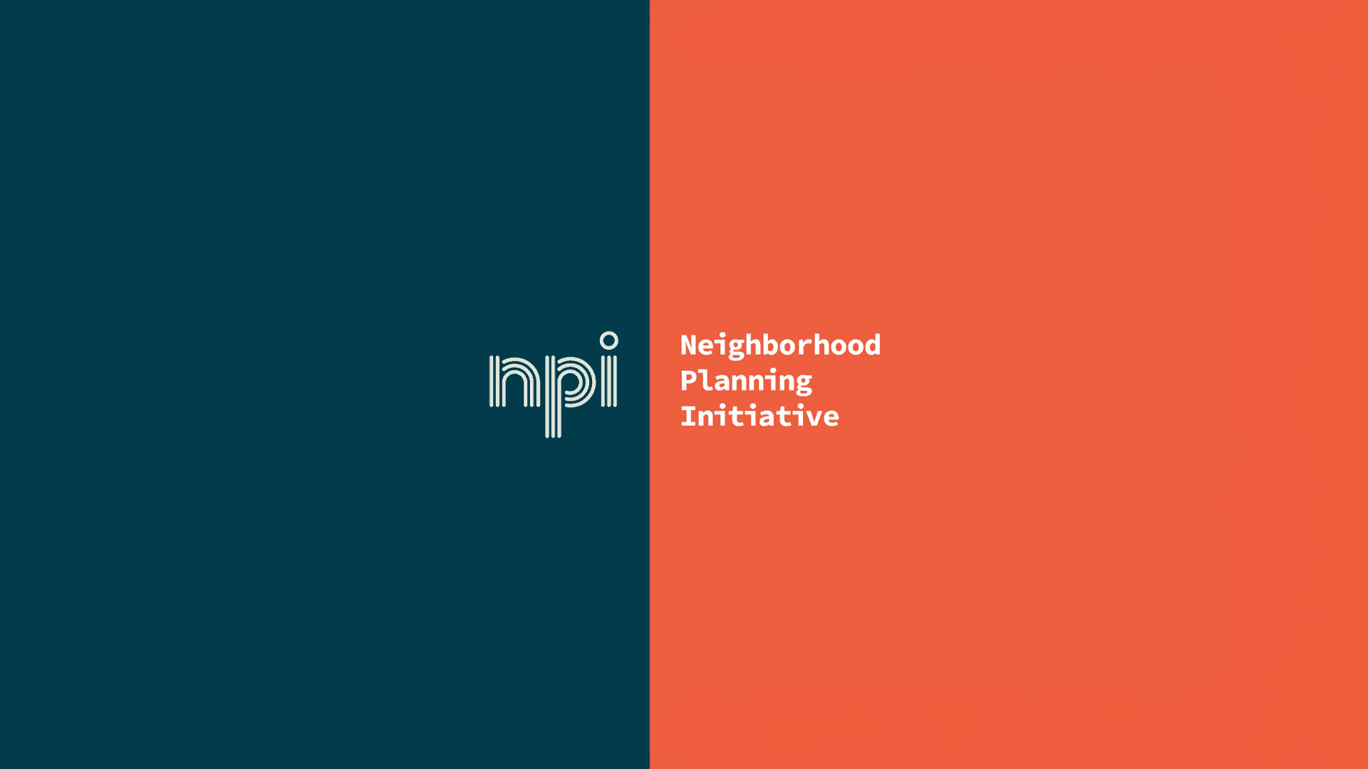
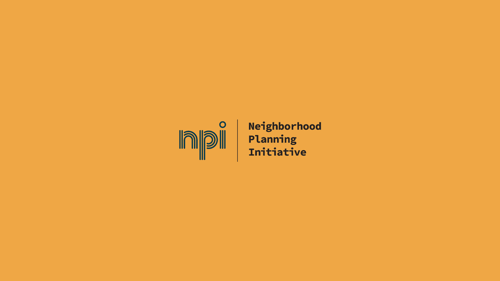
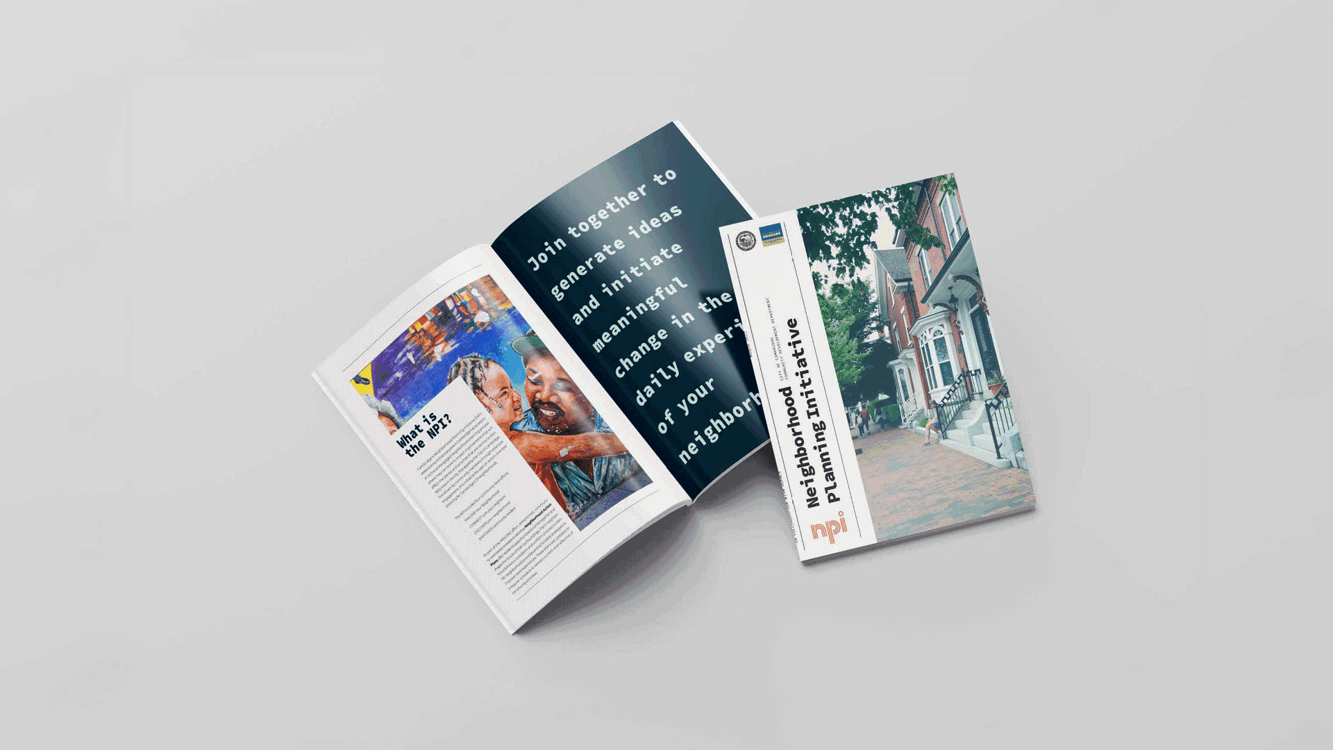
The logo uses thirteen lines and one circle to form the lowercase letters npi: each line a neighborhood, together forming a single mark. The color palette is bright and varied, reflecting the diversity of Cambridge, with strong contrast so each color can highlight a different data set in charts, reports, and presentations.