" height="115.96842105263157px" id="zg0FYVugh" width="76.53552631578948px"/></svg>)
The Gothenburg Museum of Art is a premier institution for visual art in Northern Europe. It has an internationally acclaimed collection, a robust exhibition schedule, extensive research initiatives, and a diverse range of educational programs.
The challenge
A museum with this much range needs an identity that can hold many things at once: centuries of art, current exhibitions, research, and education. It also needs to feel open to the public while staying credible as a major cultural institution.
What I found
During my research, I discovered that the museum merges the realms of contemporary and classical art seamlessly. That fusion, together with an ambitious vision to redefine the role of an art museum, gave me a clear starting point: an identity that honors tradition and looks forward at the same time.
The approach
Research the institution. I studied the collection, the exhibitions, and the museum's stated vision to understand what makes it distinct.
Define the tension. The relationship between classical and contemporary art became the central idea.
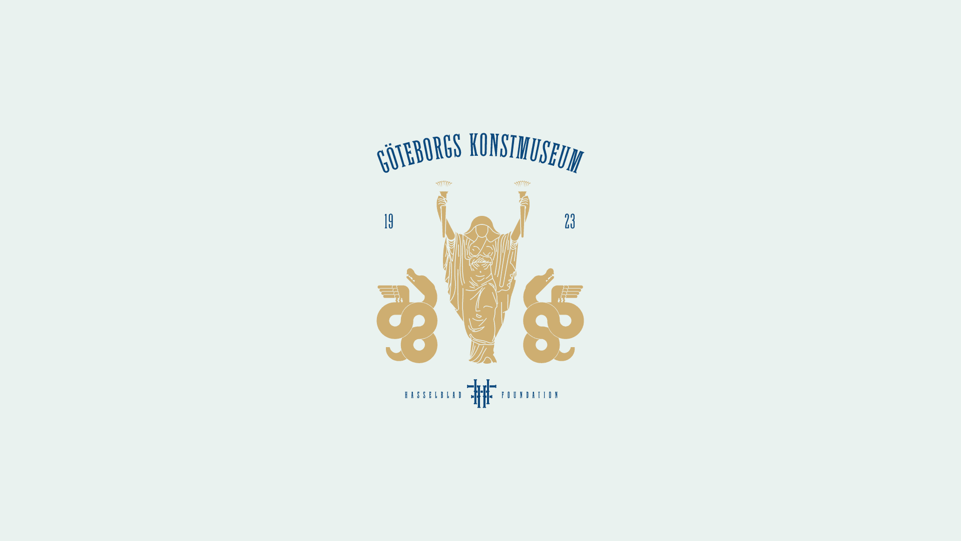
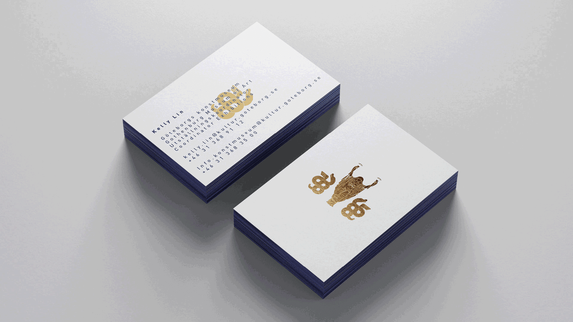
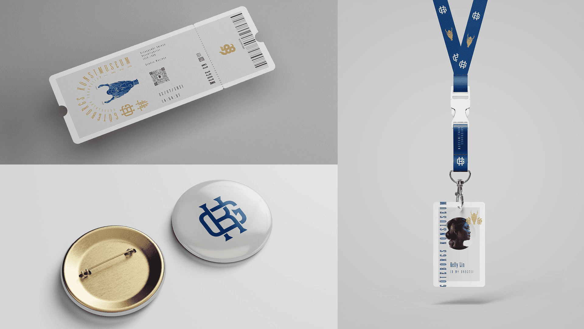
Translate it into form. The idea came from a work associated with the museum: Ceres Searching for Proserpina, a sculpture from the 1780s by Swedish sculptor Johan Tobias Sergel.
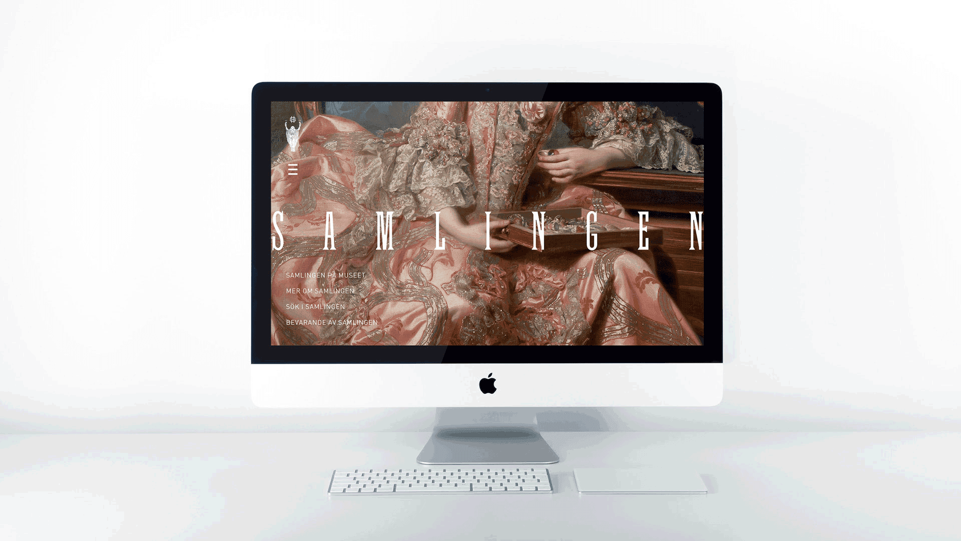
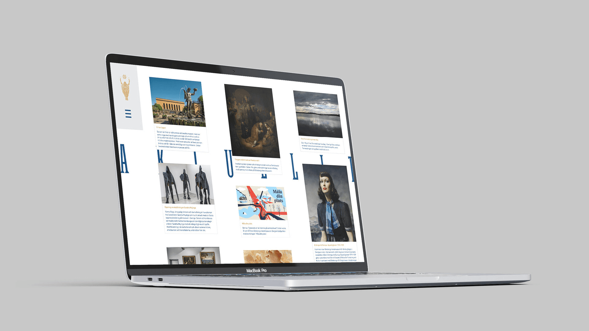
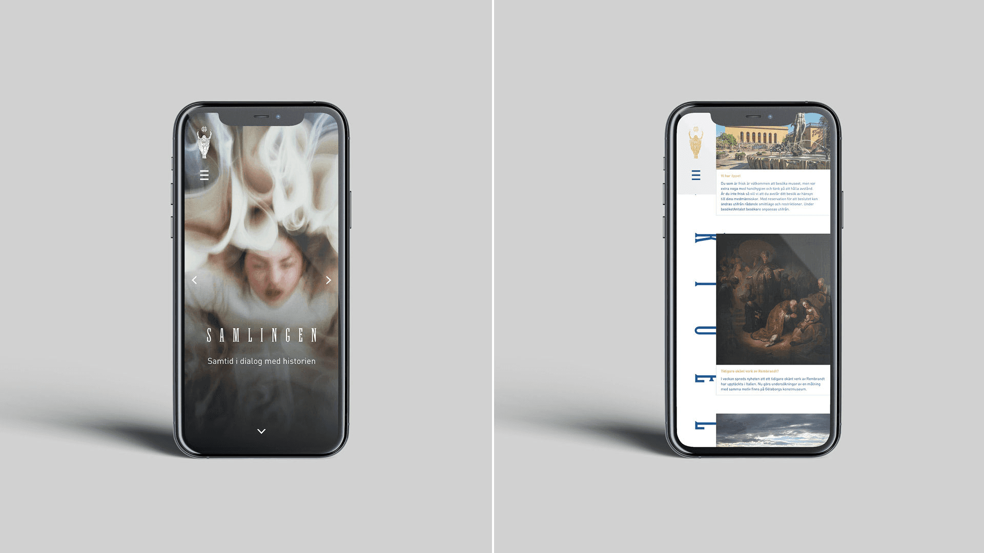
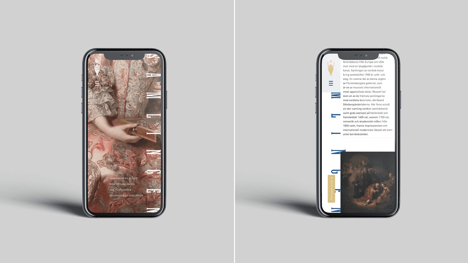
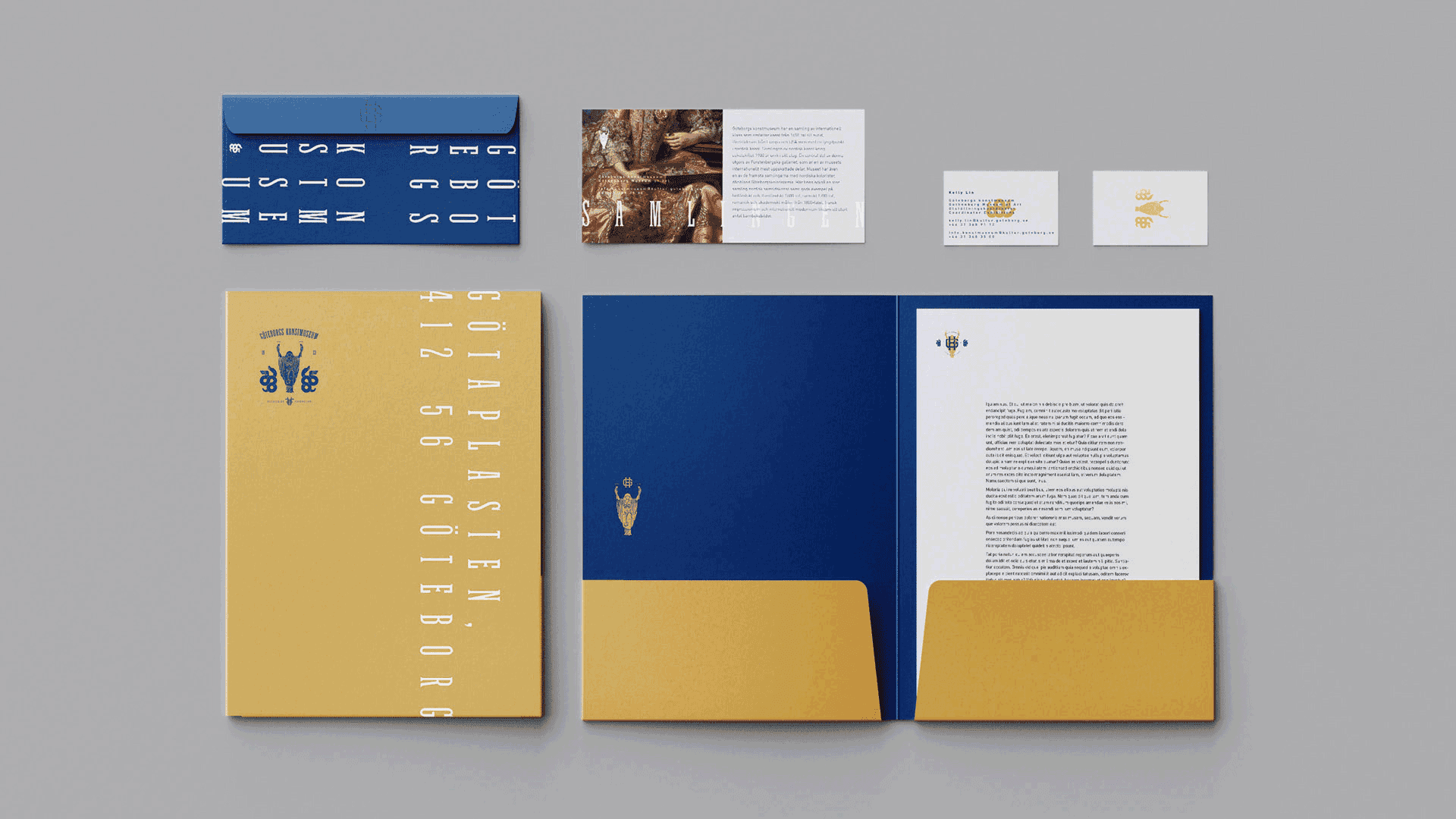
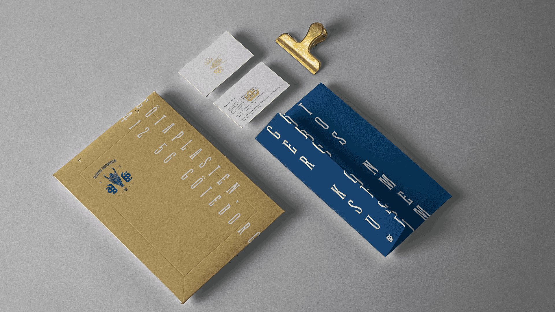
Extend it into a system. Around the logo, I paired a typeface originally designed for woodblock type with generous tracking, so it reads like a modern sans serif, and built a palette of gold, blue, and eggshell white.
The solution
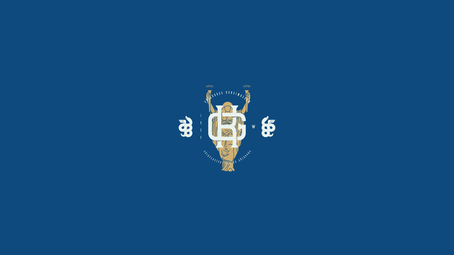
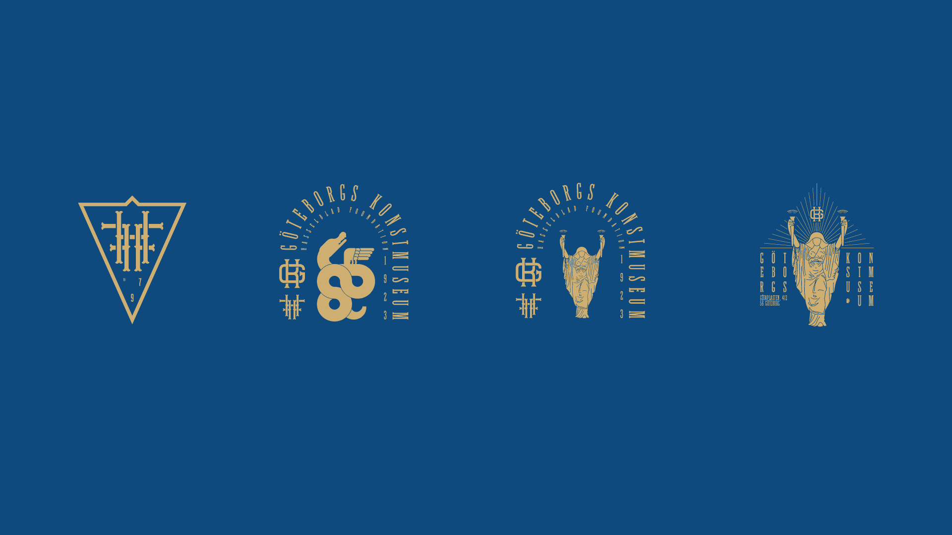
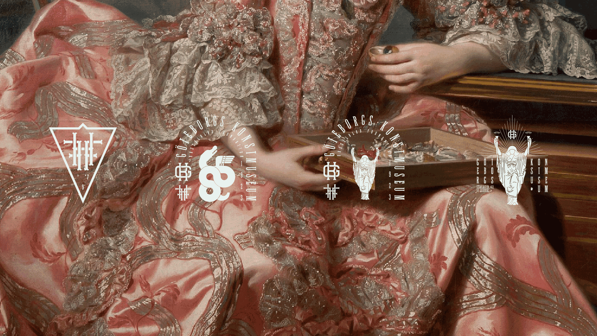
The logo grows out of Sergel's sculpture, and the rest of the brand is built to bridge classical and contemporary. The woodblock-style typeface, tracked out like a modern sans serif, connects the historic and the current, and the gold, blue, and eggshell white palette ties the system together.