" height="115.96842105263157px" id="zg0FYVugh" width="76.53552631578948px"/></svg>)
The challenge
A firm that designs public spaces for communities needs an identity that feels as trustworthy as its work. The wordmark had to be strong enough to carry credibility with public agencies and clients, and warm enough to reflect a practice built on listening. It also had to stay quiet: the places they design are the main event, not the logo.
What I found
The firm's values pointed to a wordmark instead of a symbol. A landscape architecture practice doesn't need an icon to explain what it does, and a carefully drawn name could express humility and confidence at the same time. The details would carry the personality.
The solution
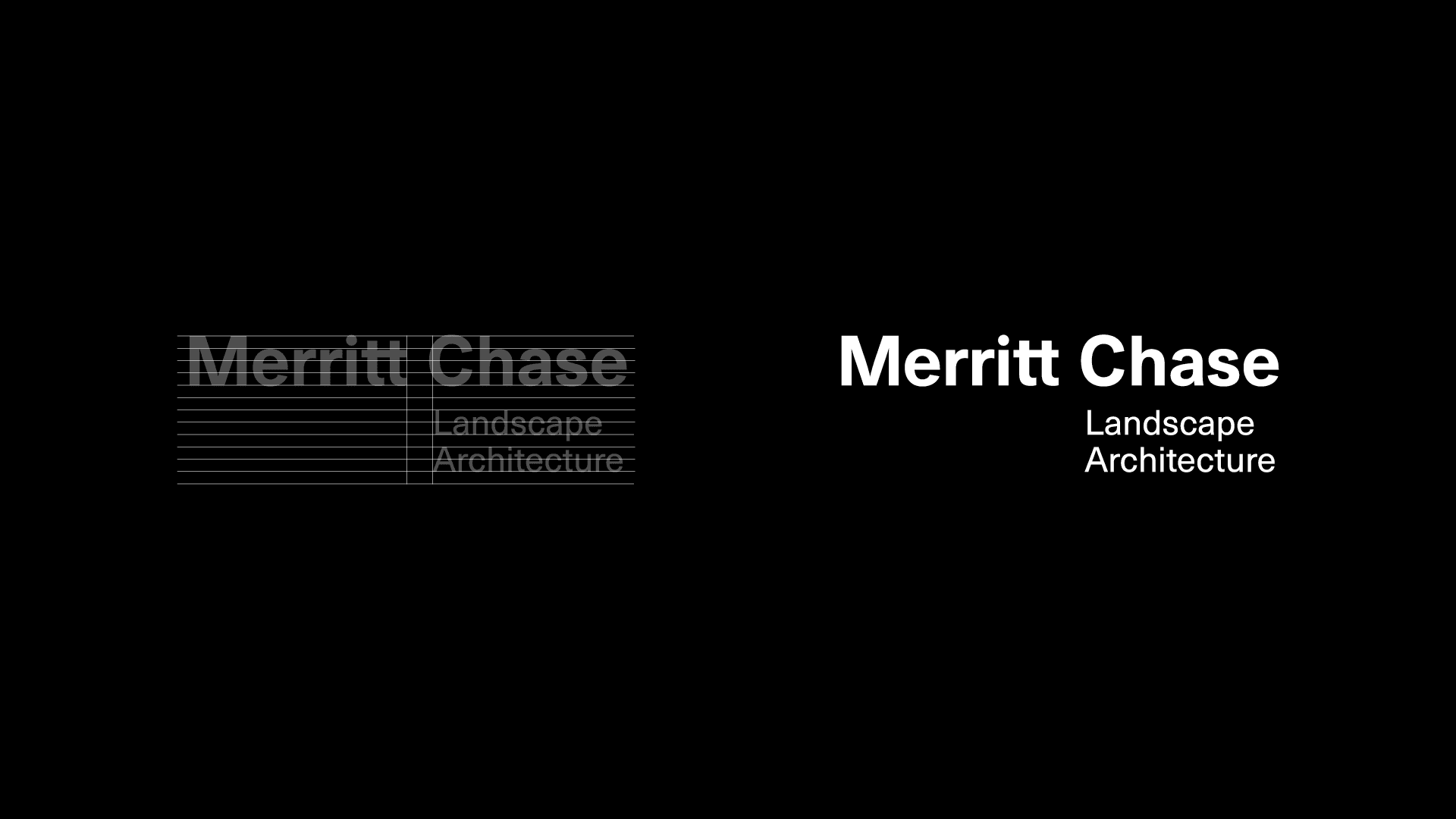
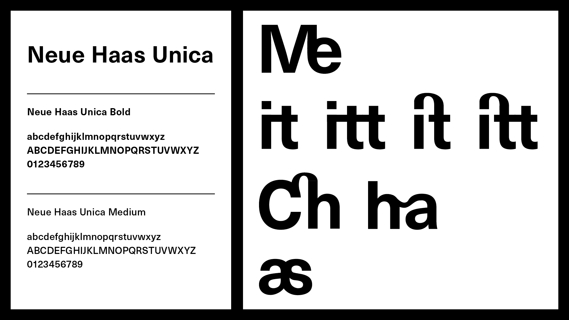
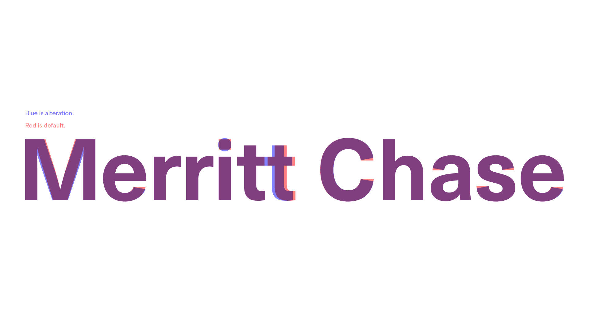
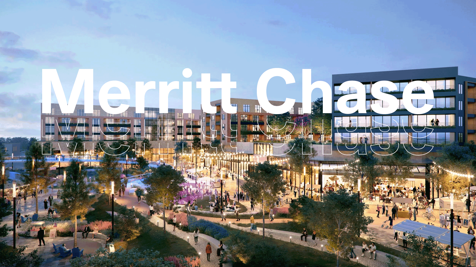
The final wordmark is clean, direct, and quietly confident. The modifications are small, but together they make the name feel custom, with balance between strength and warmth. It distills the firm's ethos into something thoughtful, approachable, and enduring.