" height="115.96842105263157px" id="zg0FYVugh" width="76.53552631578948px"/></svg>)
The challenge
Independent record stores run on community, taste, and loyalty, and those things are harder to maintain once so much listening happens online. The question was how to carry that sense of belonging beyond the shop floor without losing what made the store worth visiting.
The solution
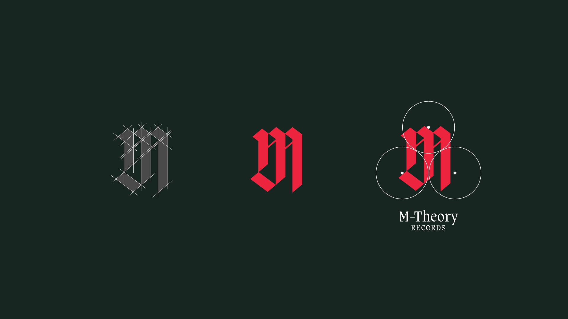
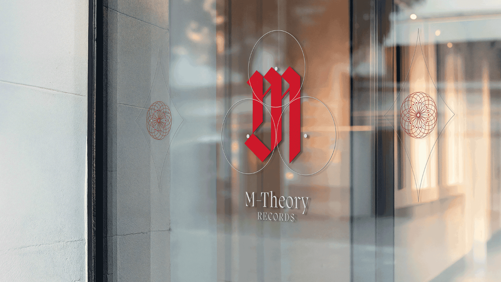
The logo is built around a spinning record, with musical notes hidden in the negative space of the letter M. The mark is simple enough to be timeless, with a detail for people who look closely. It works as a store sign, a record sleeve sticker, and a small podcast icon. [Describe the other assets you made: podcast cover art, social templates, bags, and so on.]