" height="115.96842105263157px" id="zg0FYVugh" width="76.53552631578948px"/></svg>)

Il Leone Rosso is a real family-owned business in Italy. This is one of my practice projects: I choose a business, set a tight deadline, and create as many brand assets as I can, using public information as a starting point. It is a way to sharpen my skills and test ideas. It isn't client work, it isn't a critique of the family or their business, and I make no claim of ownership over the Il Leone Rosso name or brand.
The inspiration
Il Leone Rosso, which translates to "The Red Lion," is a family-owned enterprise in Italy. It includes a cozy cafe, a pizza restaurant, and an apartment complex.
The challenge
One business with three very different places: a cafe, a restaurant, and apartments. The identity had to feel at home in each, while still reading as one family and one standard of care.
What I found
In my research, I noticed a gap between the business's current logo and the atmosphere inside its establishments. The places feel warm and carefully run, and the logo didn't reflect that. The opportunity was to bring the visual identity up to the quality of the experience.
The approach
Start with the values. I looked for what the business stands for: family unity and a steady commitment to excellent service.
Match the identity to the atmosphere. The goal was a look that fits the ambiance of each location and makes patrons feel pride and satisfaction.
Move the brand upscale. The identity needed to signal the quality and standards of the cafe and pizza restaurant.
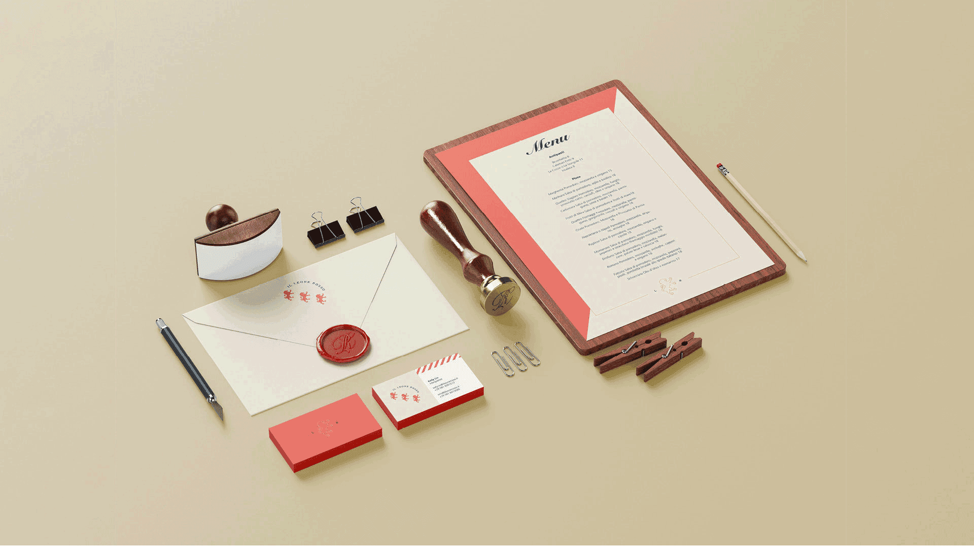
Build a system with range. A primary logo for formal use and a secondary mark for smaller, everyday applications.
The solution
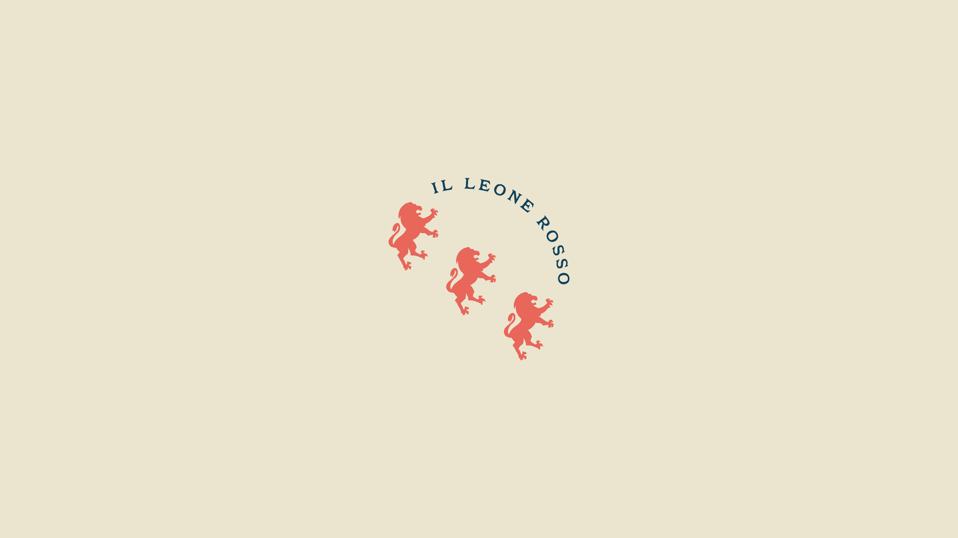
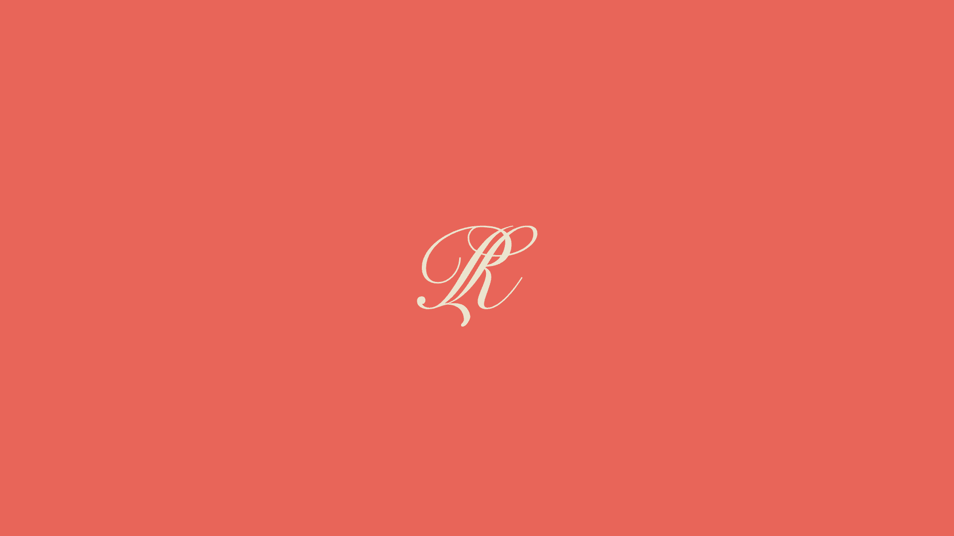
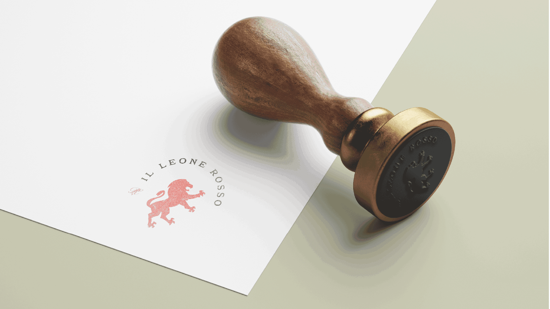
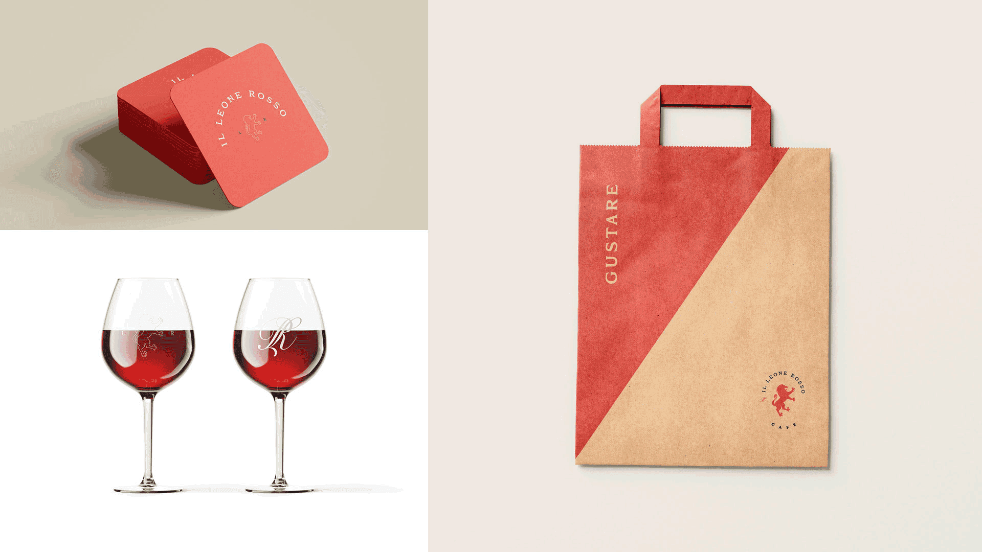
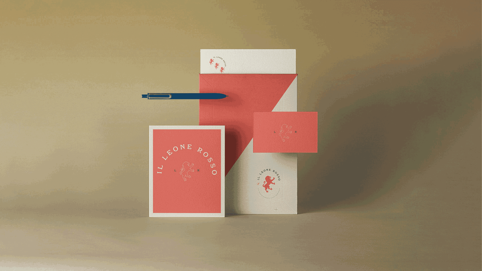
The primary logo is a heraldic lion rampant, a traditional symbol of strength, courage, and heritage that gives the name a literal and dignified form. The secondary mark is a monogram that joins the letters L and R, a compact version for signs, cups, menus, and small spaces. The palette is a softer red, navy blue, and khaki, a more refined take on the red in the name that feels welcoming and upscale at once.